Metalmorphosis.
That's right. You heard me--metalmorphosis. I have that copyrighted ;-)
It's what happens when a series of metal artworks completely transform a space, big or small.
I recently had the pleasure of installing a few metal artworks that would metalmorphosize a hallway by bringing nature inside this very large commercial space.
Fortunately for me, the walls were long and the ceilings were high which meant we could be really creative with the configurations of the panels. Also, the light in the setting was controlled with no drastic and direct sunlight infiltrating the walls, which meant we could go all-out---selecting some shiny, glossy gems for the space without the possibility of glare.
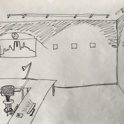
First, we selected the locations for the artworks throughout the hallway which helped us determine the size.
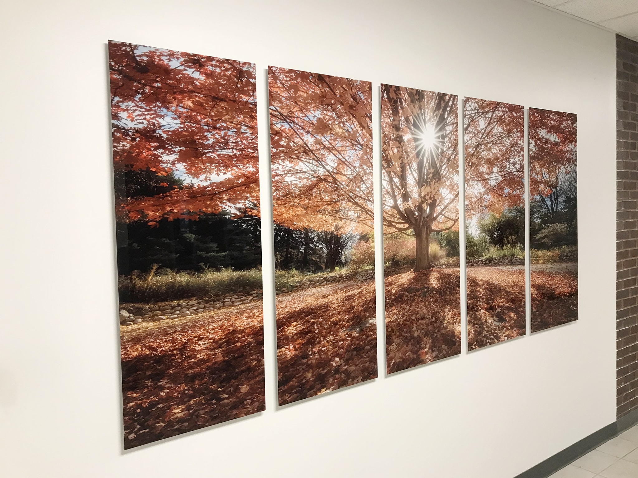
We started with a classic metal configuration---a 5-panel panorama to punctuate the symmetry of the artwork.
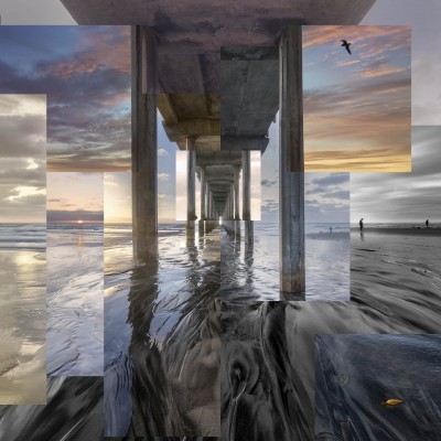
We wanted the element of surprise which led us to explore much different, non-traditional panel configurations.
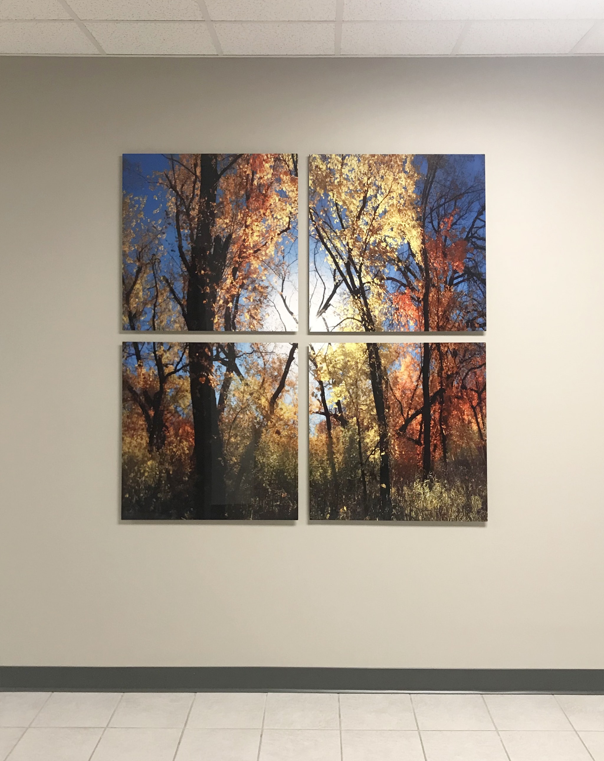
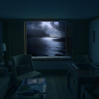
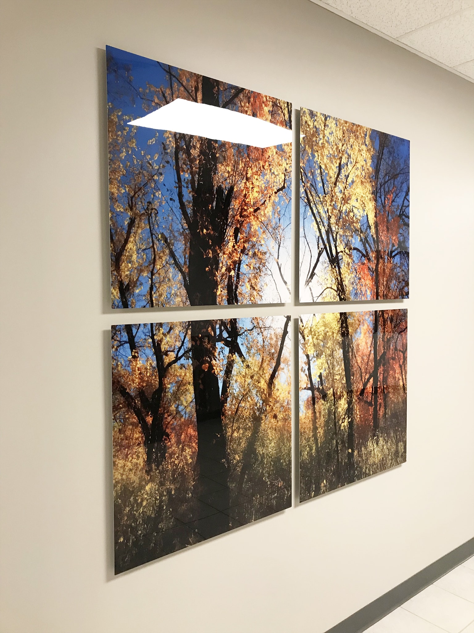
To keep the space feeling tall and open, we decided on a 4-panel square configuration. Stacking panels vertically increased the height relative to all of the other finishings in the space including signage, doors, and the other artworks. If it was done right, we would have the illusion of looking out a window. Because this configuration was decided first, I knew I had to find the perfect image.
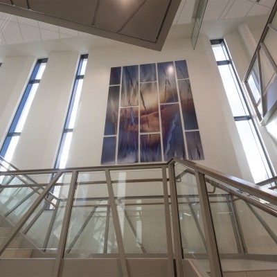
Last, we had a huge span of hallway.
This would be the metal mothership.
It had to be wide and dramatic. This meant I had to dig out an incredibly huge panorama that would compliment the others.
I narrowed it down to a few, and then we declared a winner.
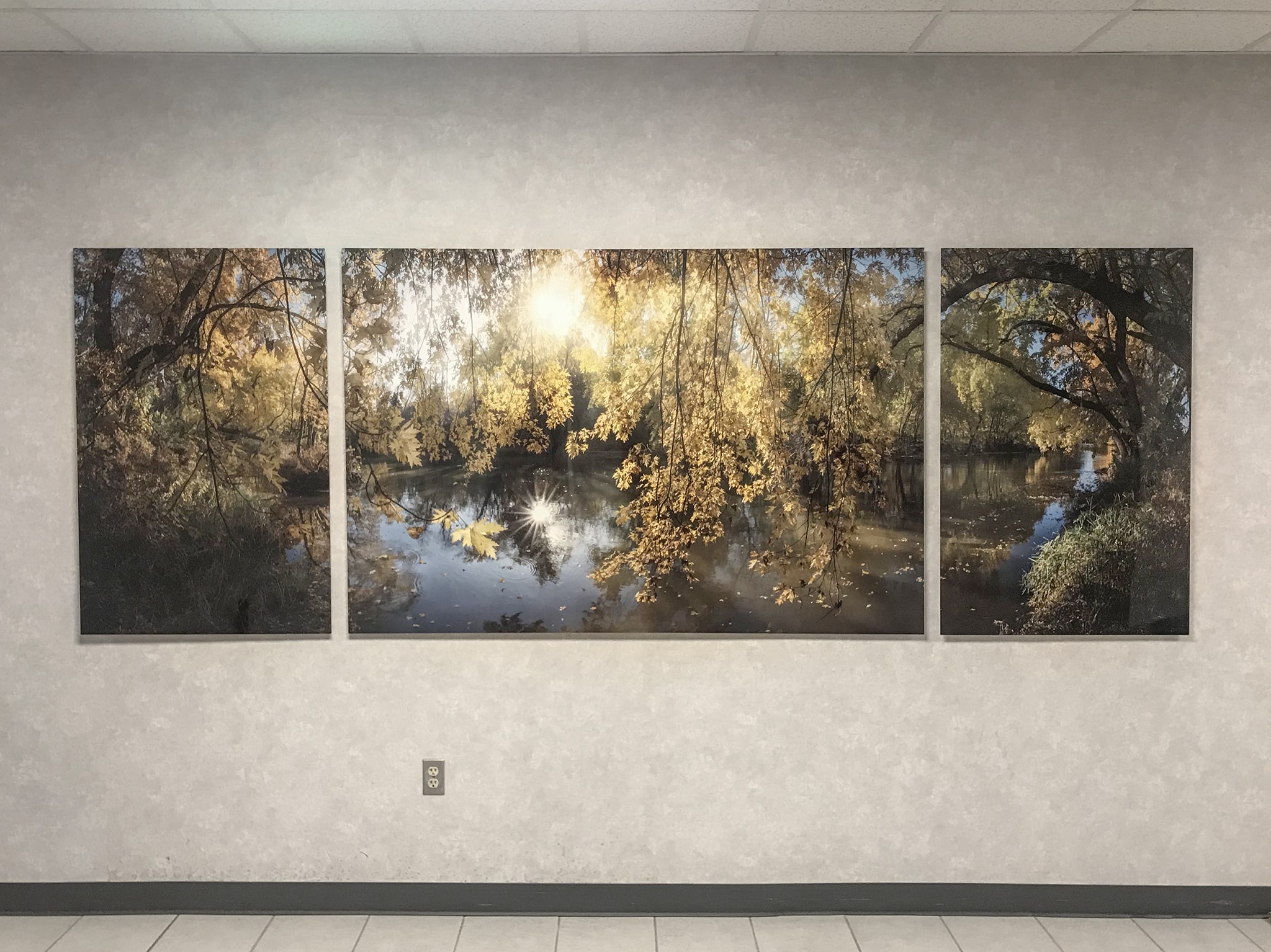
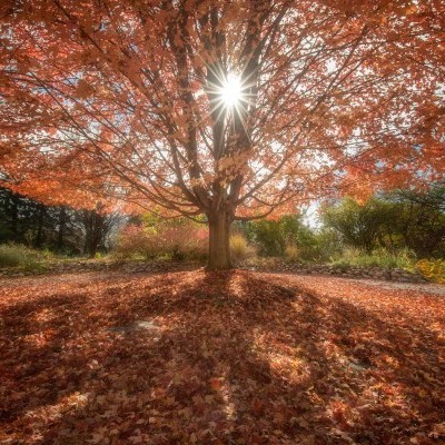
The dangling leaf had to be emphasized and not lost when it came to the panel configuration. Additionally, behind it, there were ripples from other falling leaves which I wanted to make sure stood out as well.
The trees on both sides towered over and served as great "book ends." They were still part of the whole, but took a half step back so the middle panel could take center stage.
This is metalmorphosis at its finest folks. I've seen it time and time again, and it is normally as cool as seeing a real butterfly shed it's cocoon to fly ;-)

