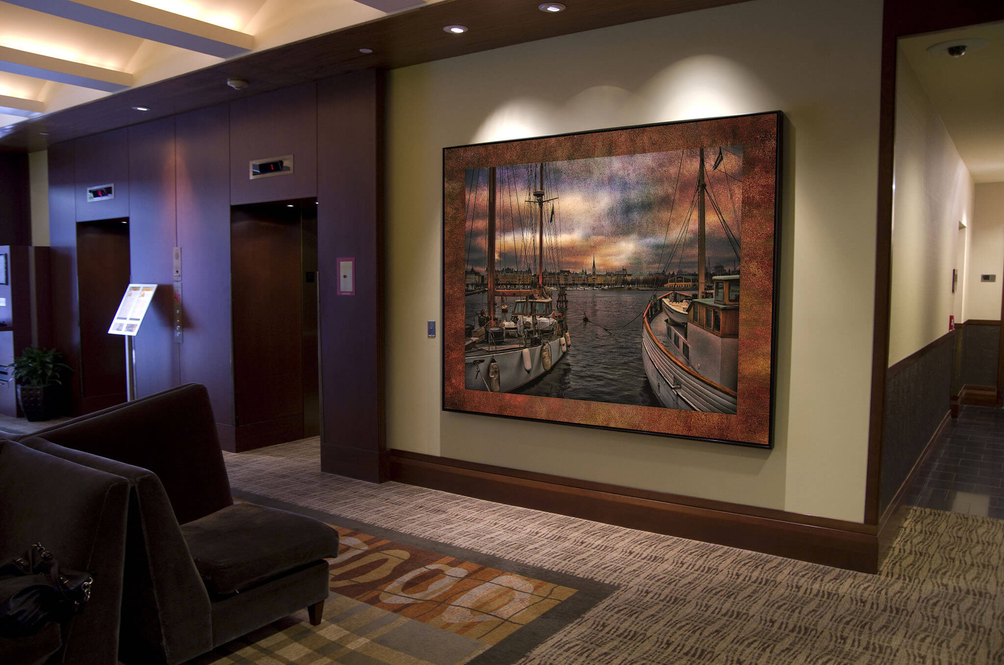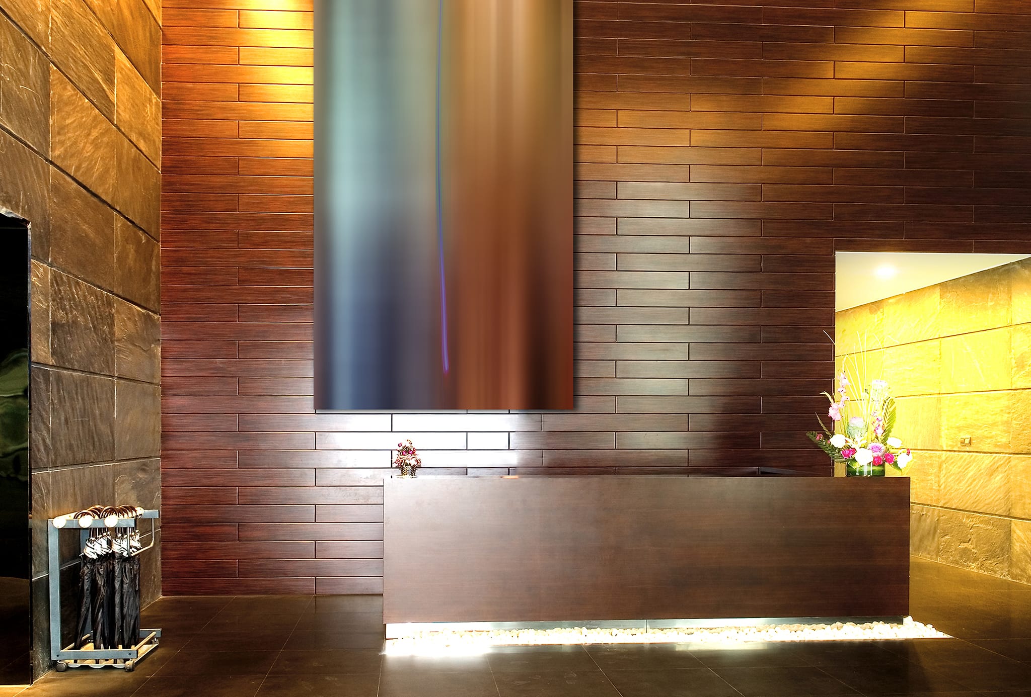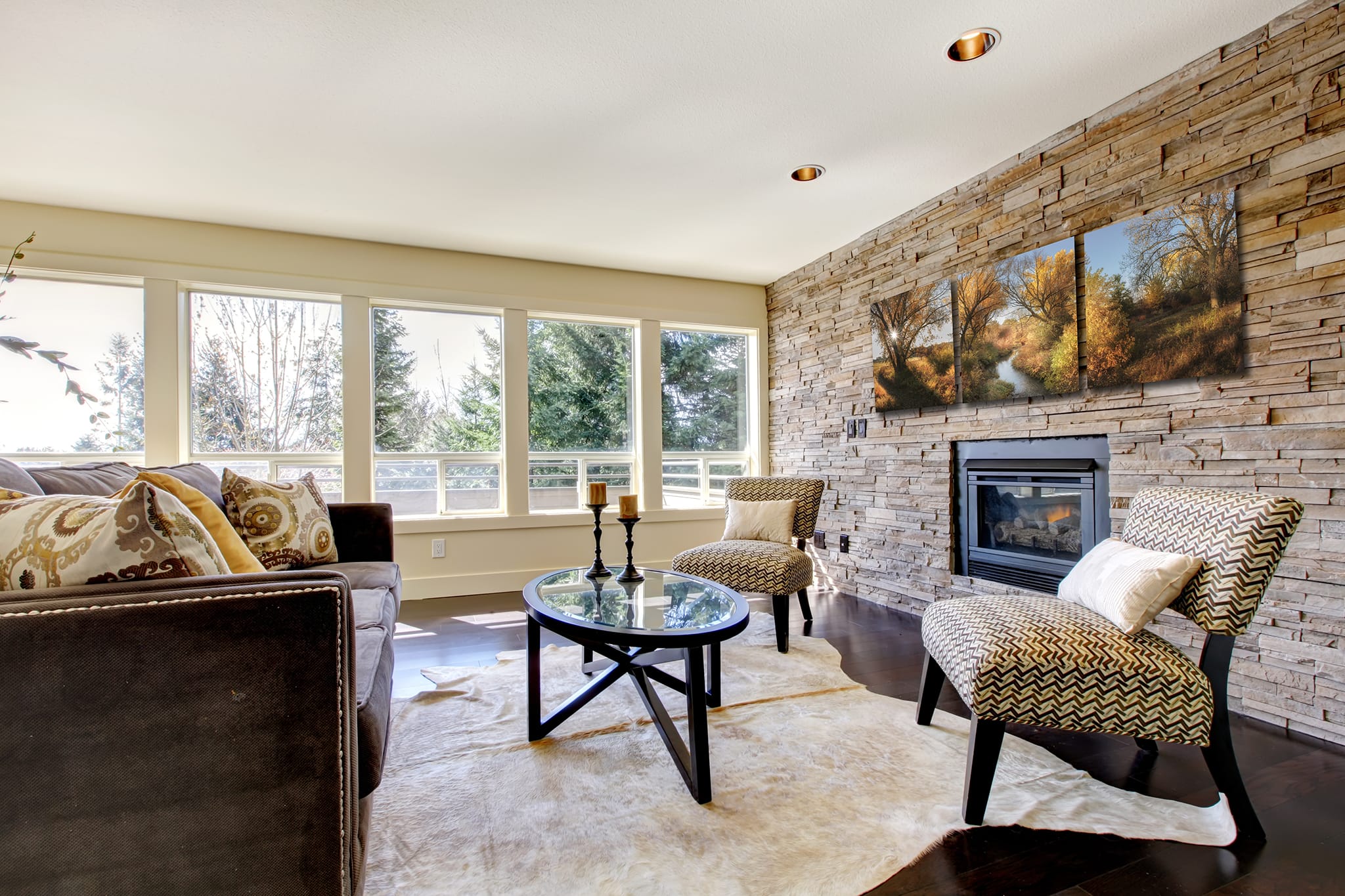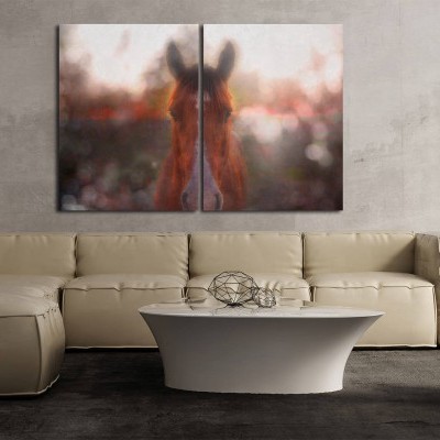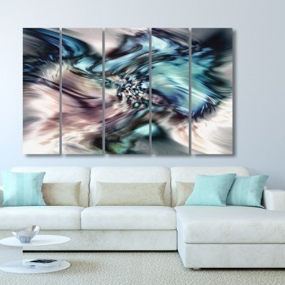
A common mistake I see is when an artwork is too small for its place on the wall.
A situation when this frequently happens is when it is intended to be the main focal point on the wall. This means there is not much else on the wall except the art.
By the way, if you’re looking for what size to make your artwork in pretty much any situation like above your bed, above your couch, and other scenarios, be sure to use my online art size calculator which will guide you.
For a focal wall, here’s a rule of thumb:
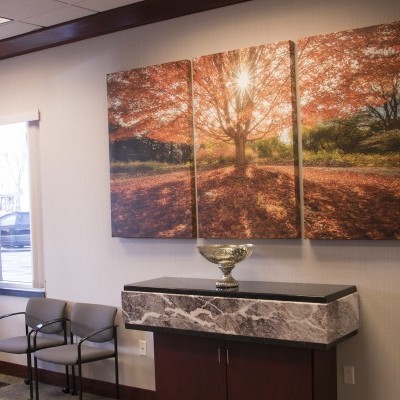
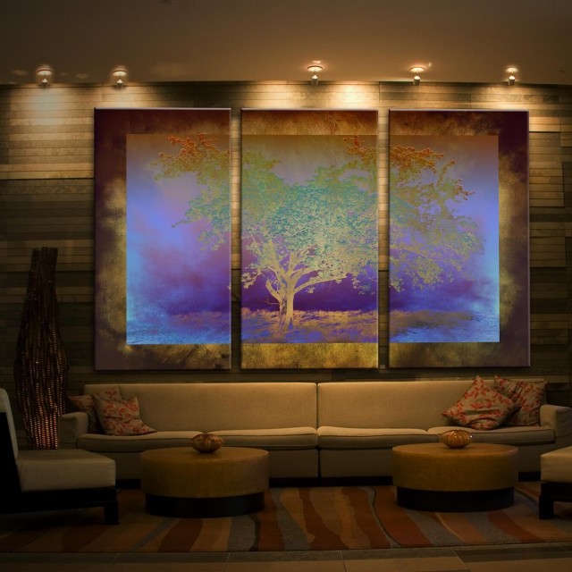
The artwork footprint should take up at least 55% of the width of the wall. A more ideal range is 60-80% of the wall width. Again, this is a ratio that works most of the time and is a pretty safe bet.
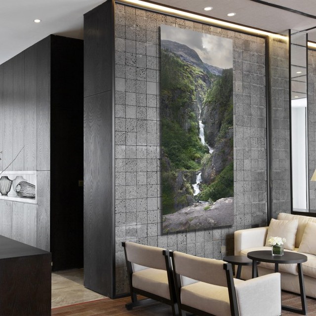
One possible exception would be if the wall is extra tall, where you could make a slim (tall and narrow) as long as it extends the majority of the height of the wall.
So what happens if I have artwork that is too small for my wall? Here are some options.
1. The most obvious solution is to repurpose it and put it somewhere else. Let's be honest. Not only does the space and wall look weird, but the artwork isn't shining the best it can either. More attention is drawn to the blank space than the art itself.
2. Creatively add size to it. For example, you could use wall paint to create borders around it and visually extend its size on the wall. Or, have your picture framed and an extra thick mat for a larger footprint on the wall.
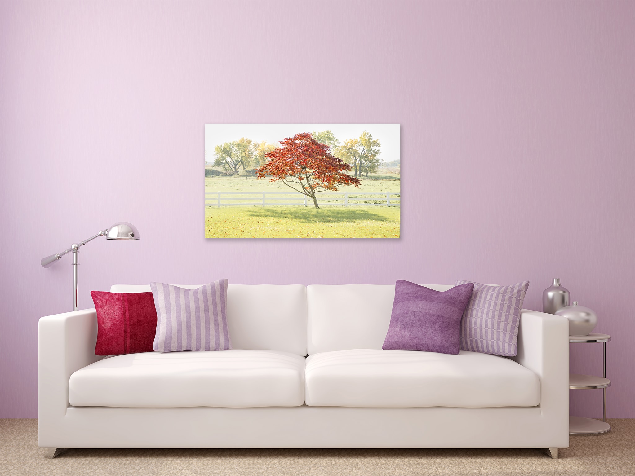
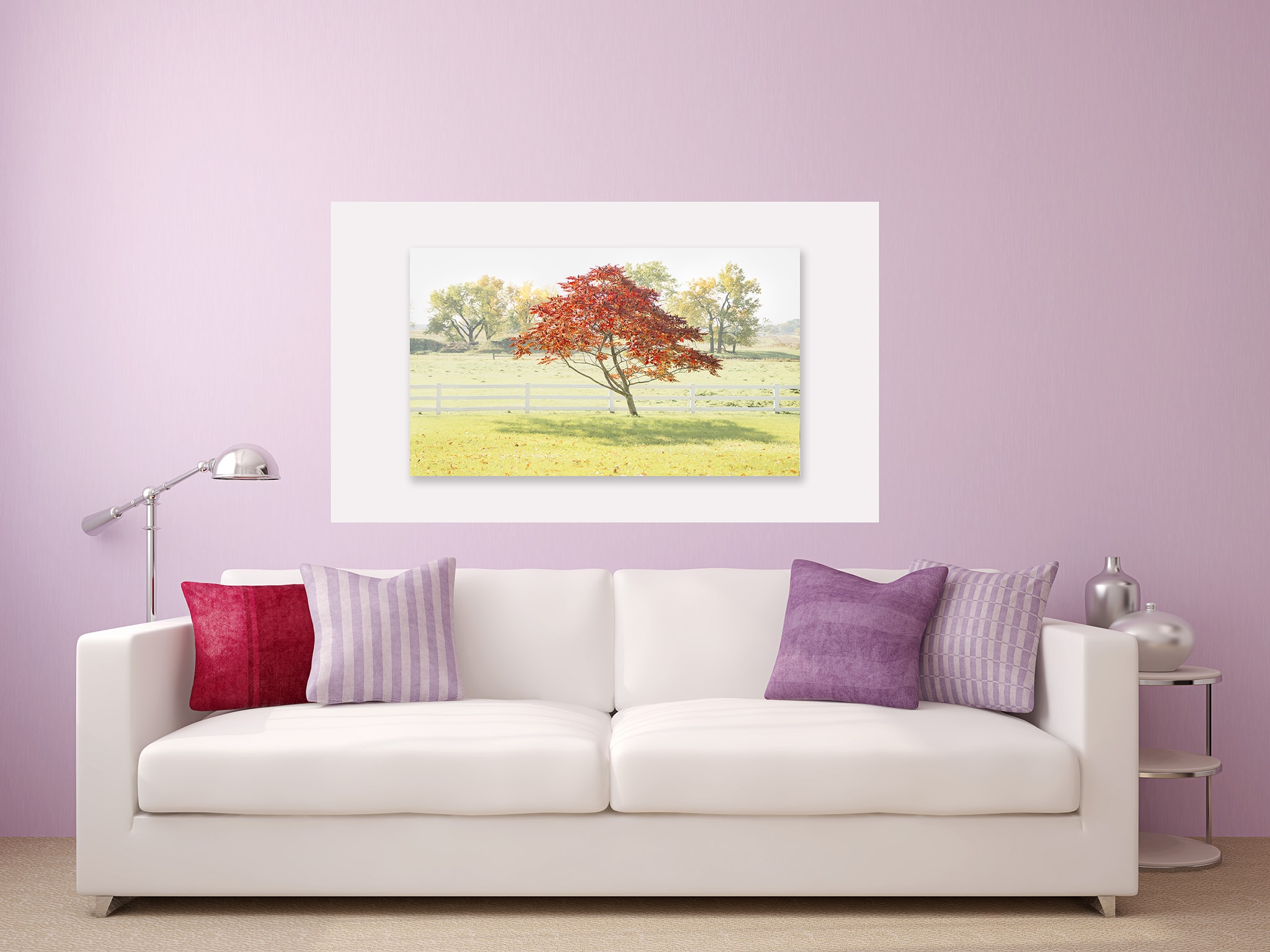
3. Find other artworks that could accompany it and make it a series of artworks versus a singular one.
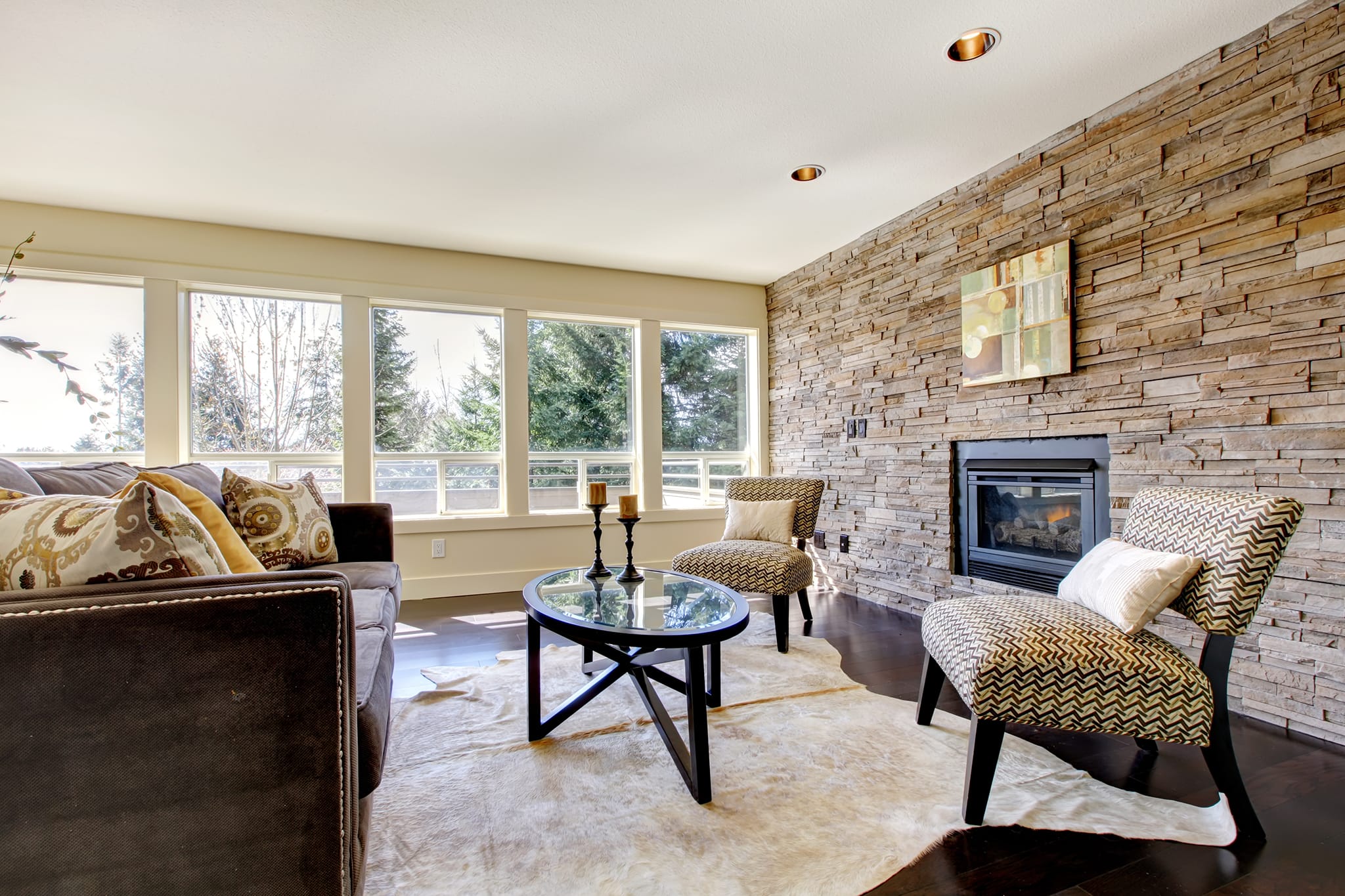
I can even help you create new artworks to go with your existing ones. Check out this real-life scenario.
4. In some situations where the artwork is just a tad too small, you can shift the artwork to either one side of the wall or the other rather than the center. It places the emphasis more on intentional placement than its size.
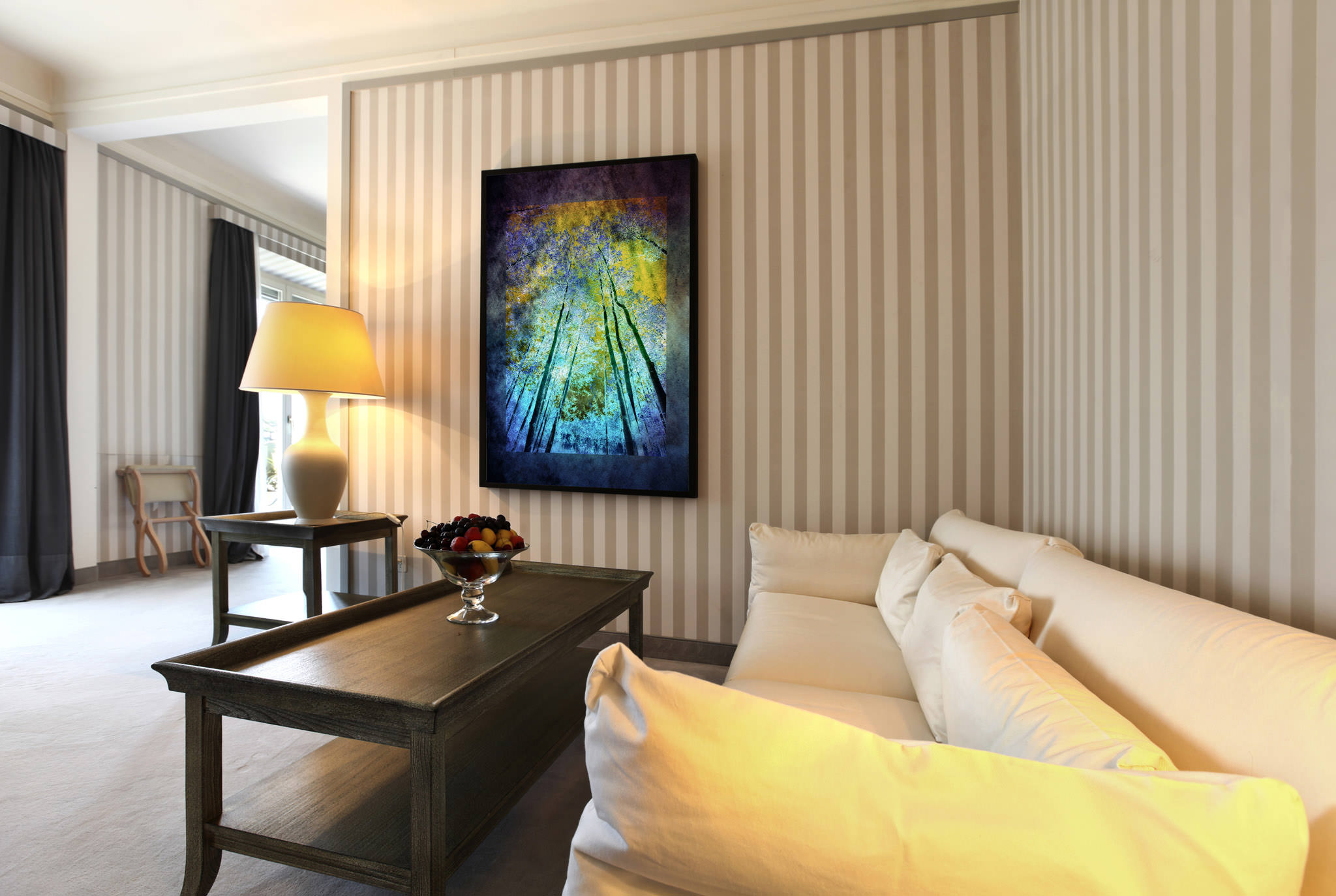
Have an artwork size conundrum? Please contact me and I'd love to help!
