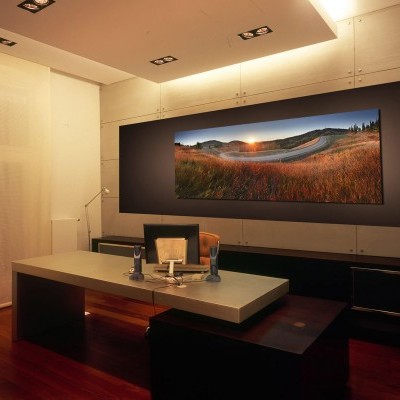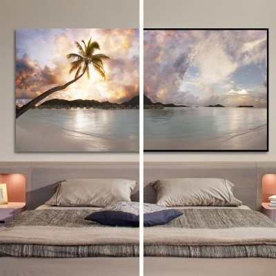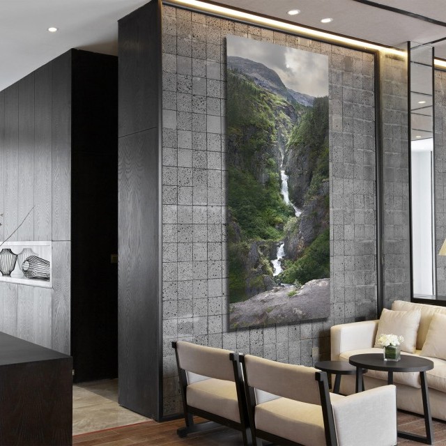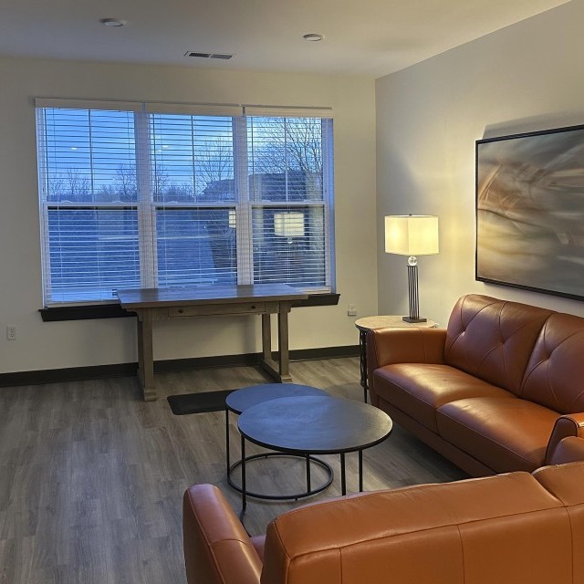
Behold the power of carefully planned and designed artwork.
Maybe this sounds dramatic, but I've seen this over and over again. I've had the opportunity to be a part of many office transformations and I'm happy once again to show another to you.
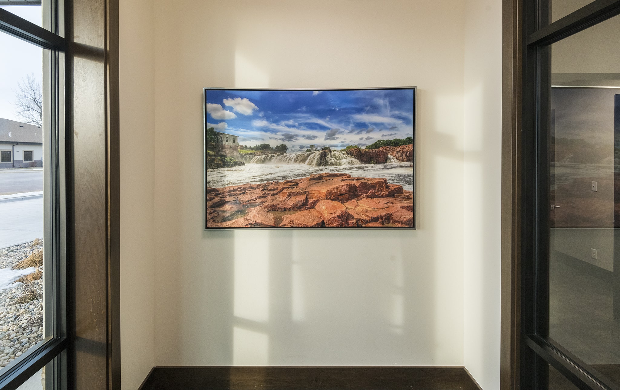
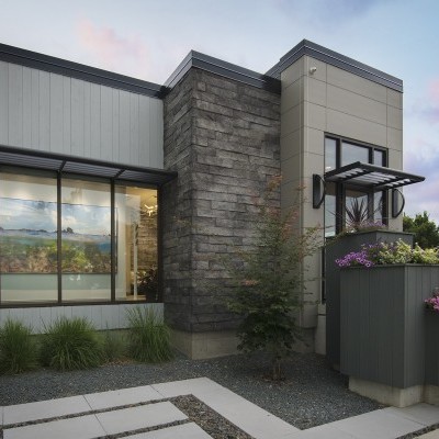
The experience all starts at the front entrance. A more familiar scene welcomes them with warmth.
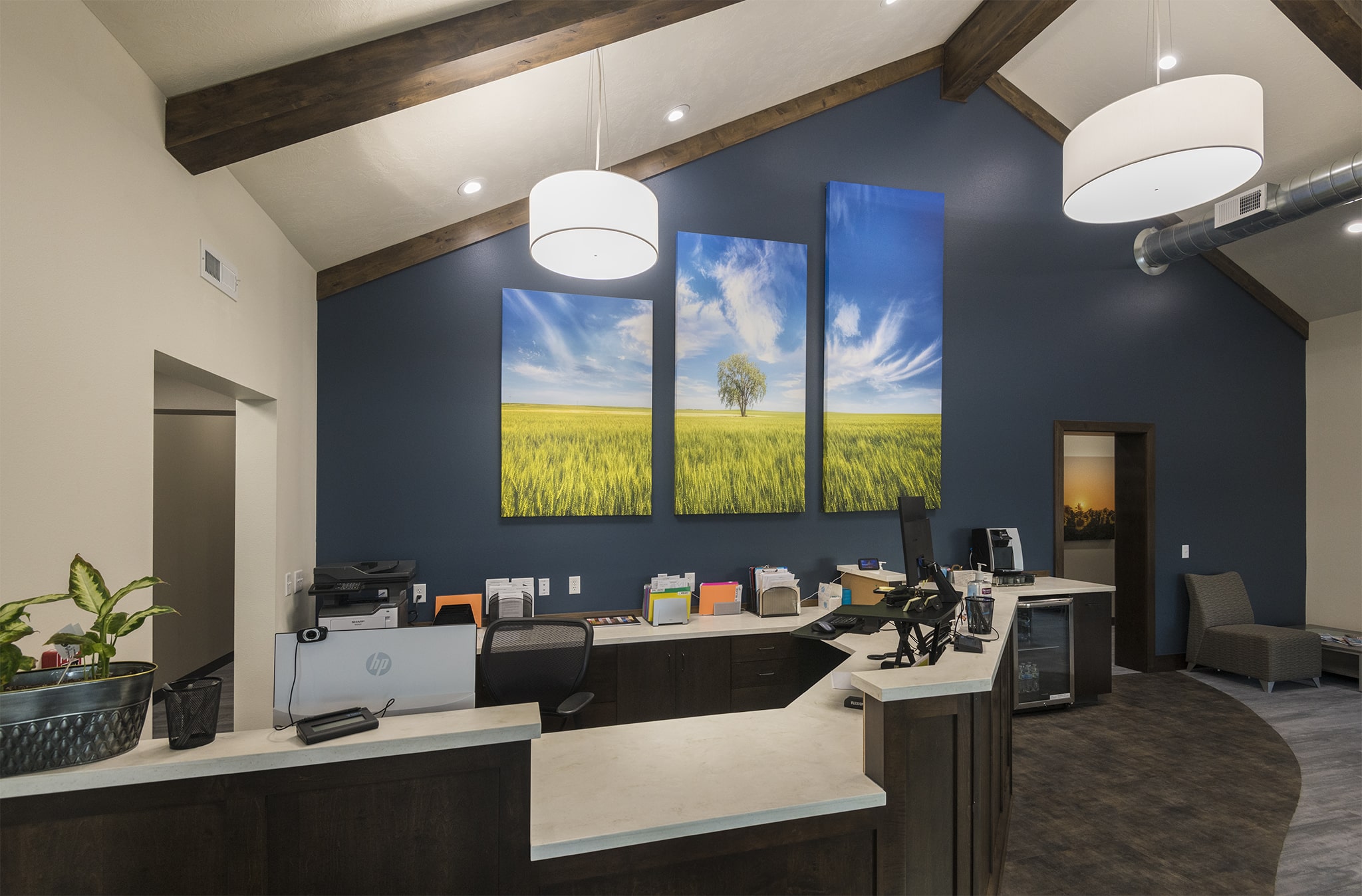
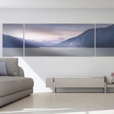
Walking in the main door and the visitor is greeted with a huge, intensely designed, 3-Panel artwork. The image is closely associated with the brand.
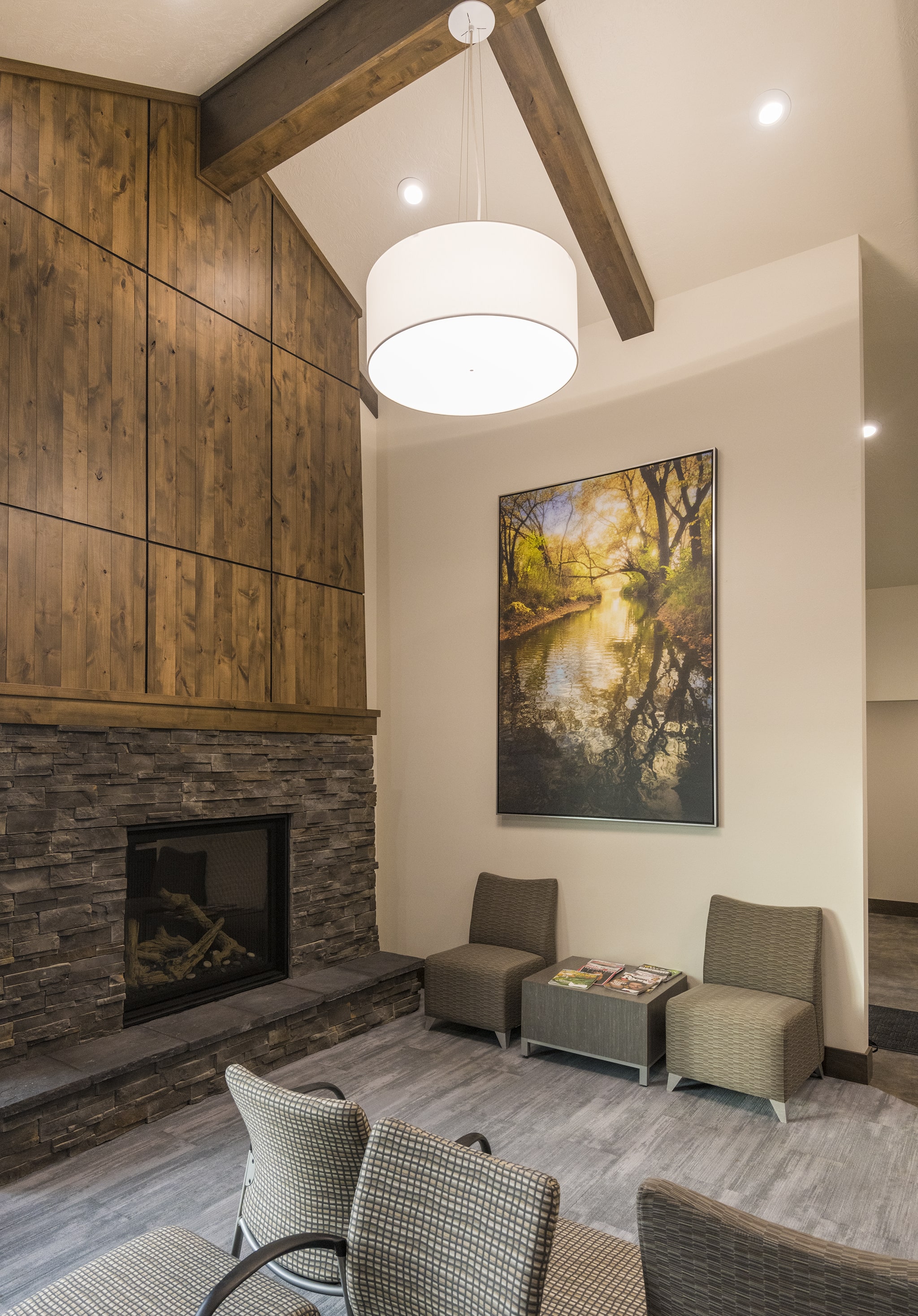
As you enter the main reception area, a fireplace and a more painterly and abstract fall scene awaits.
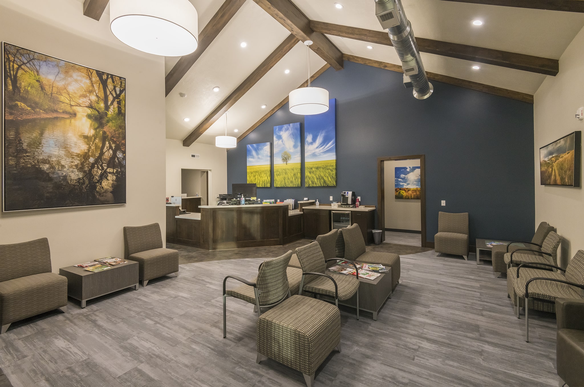
Now it all can be seen---how each artwork was arranged to introduce new colors, shapes, and sizes.
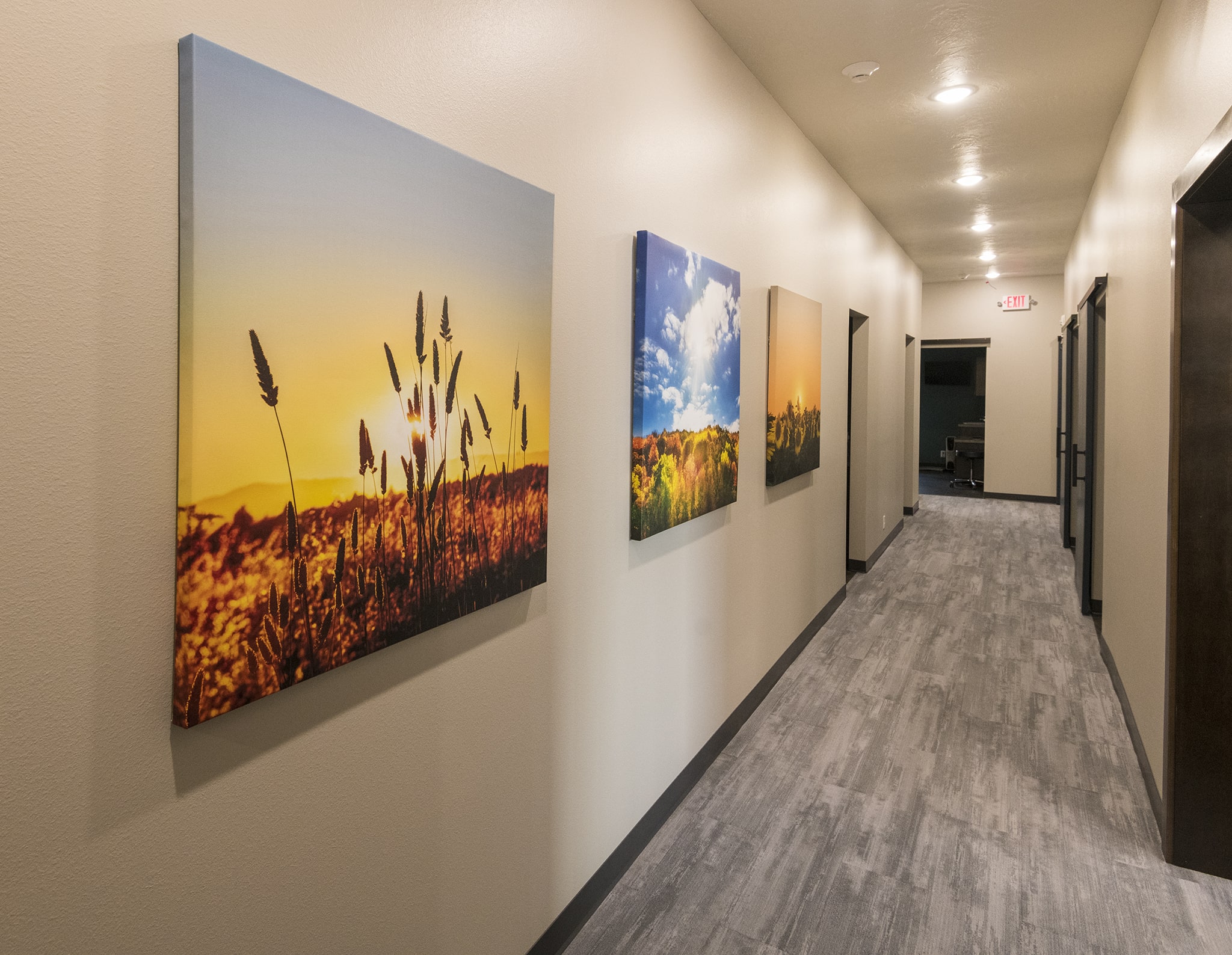
Enter the hallway and you see a series of related images that keep the eyes entertained and the soul soothed.
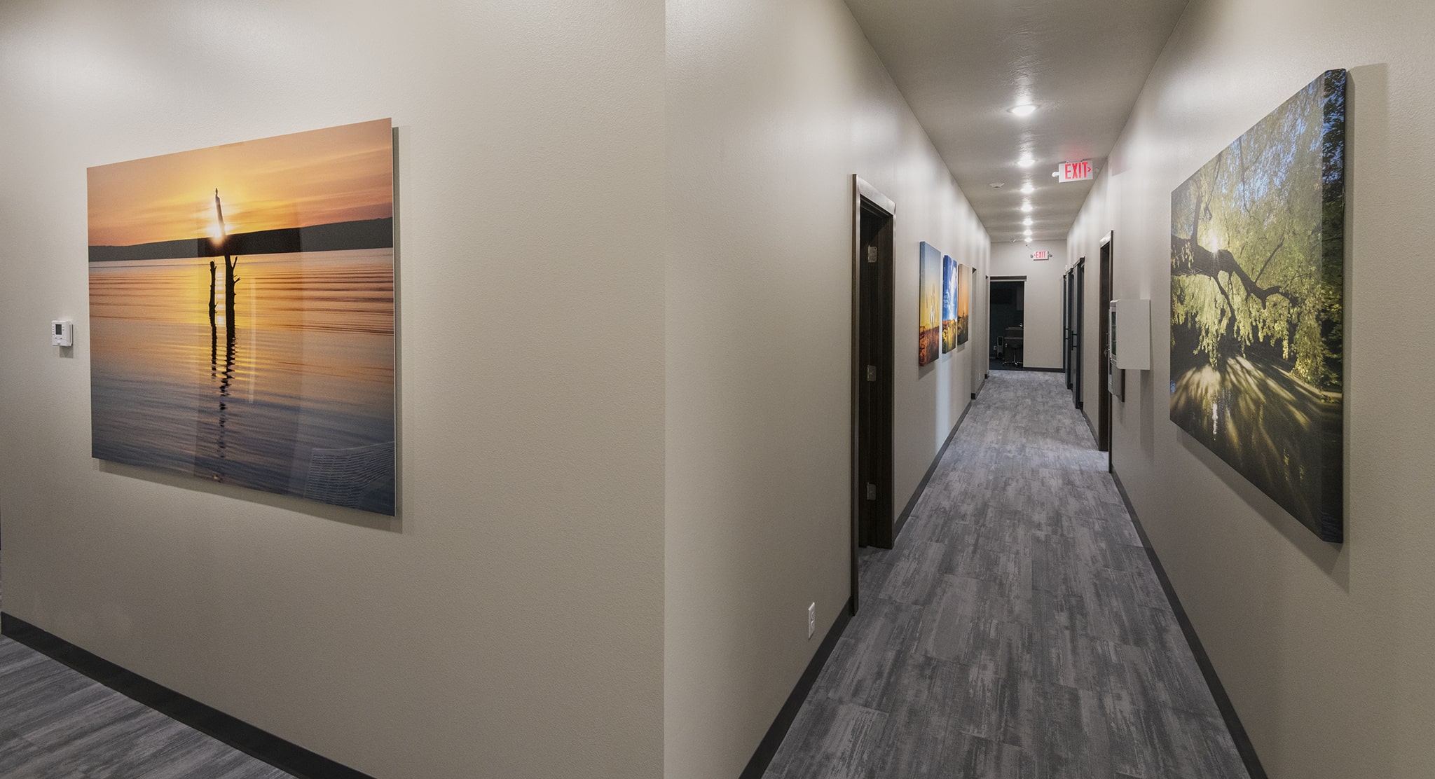
Bend around the corner, and a large oversized metal artwork shines with another tranquil scene.
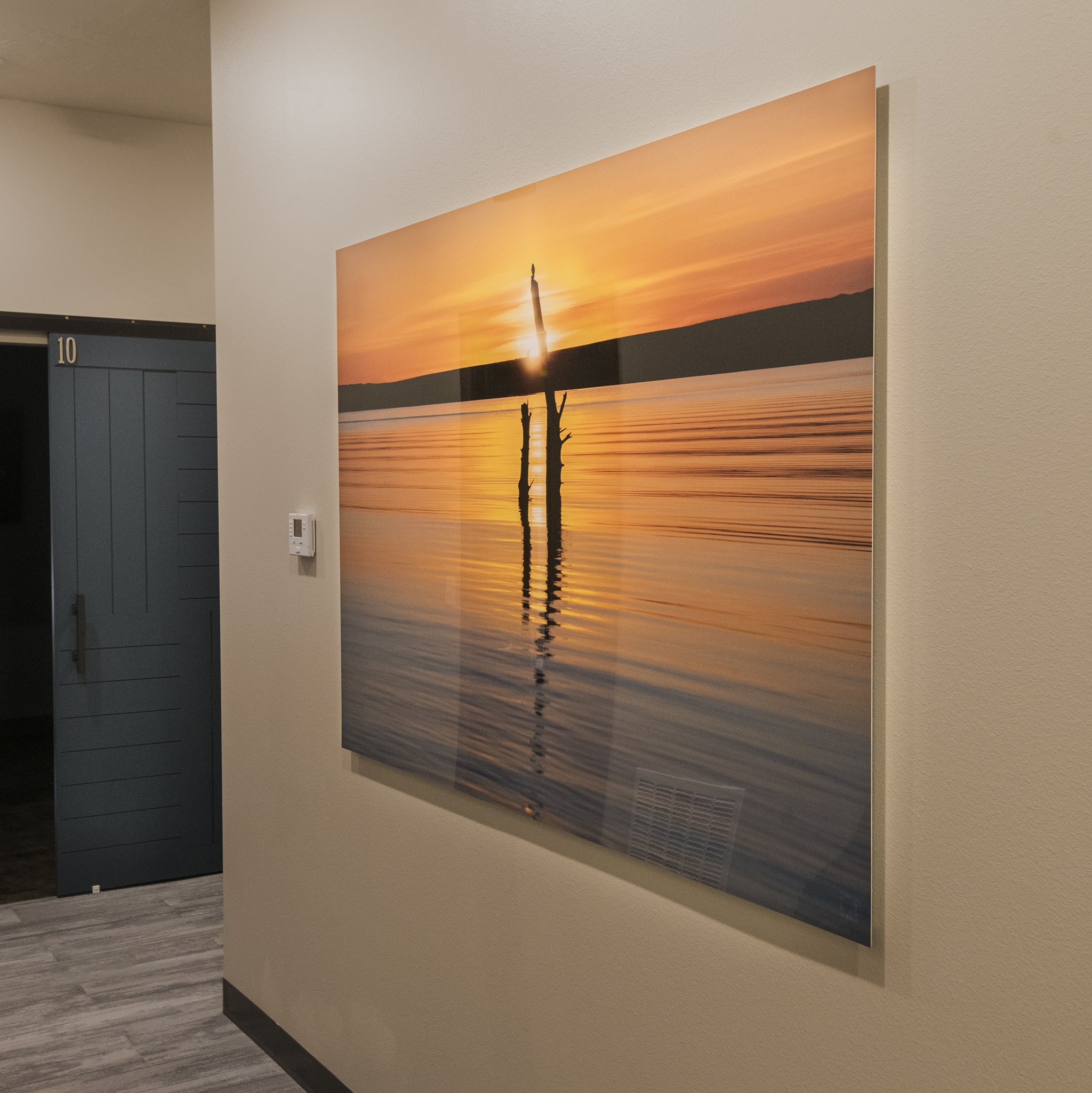
The change in material from canvas to metal offers an intriguing visual switch-up. This one is high-gloss to give that sheen to the water and bringing the scene to life.
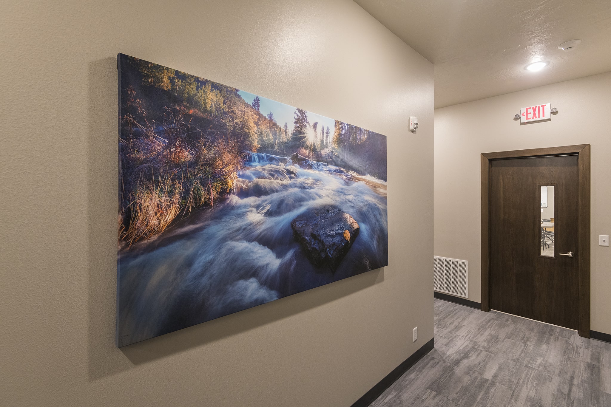
Rounding another corner offers an image with more movement, yet is still peaceful.
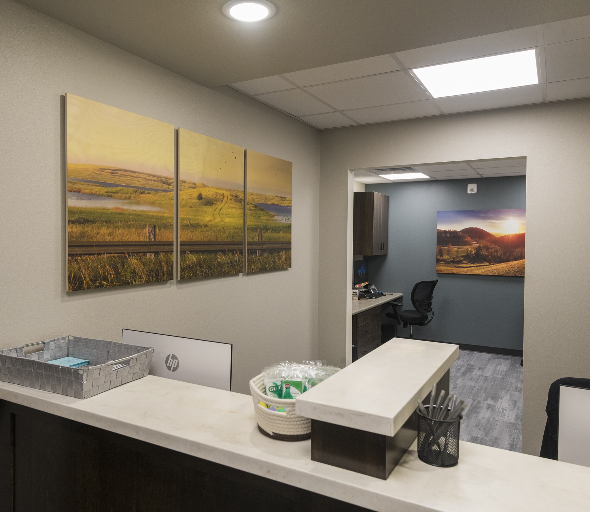
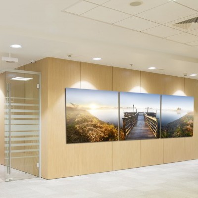
The journey concludes with yet another fun surprise, a 3-panel wood artwork. The grain shows through and makes you want to examine it up close.
I love the results from this project and I love the art that made it.
But this note is what makes my day, my week, and my year.
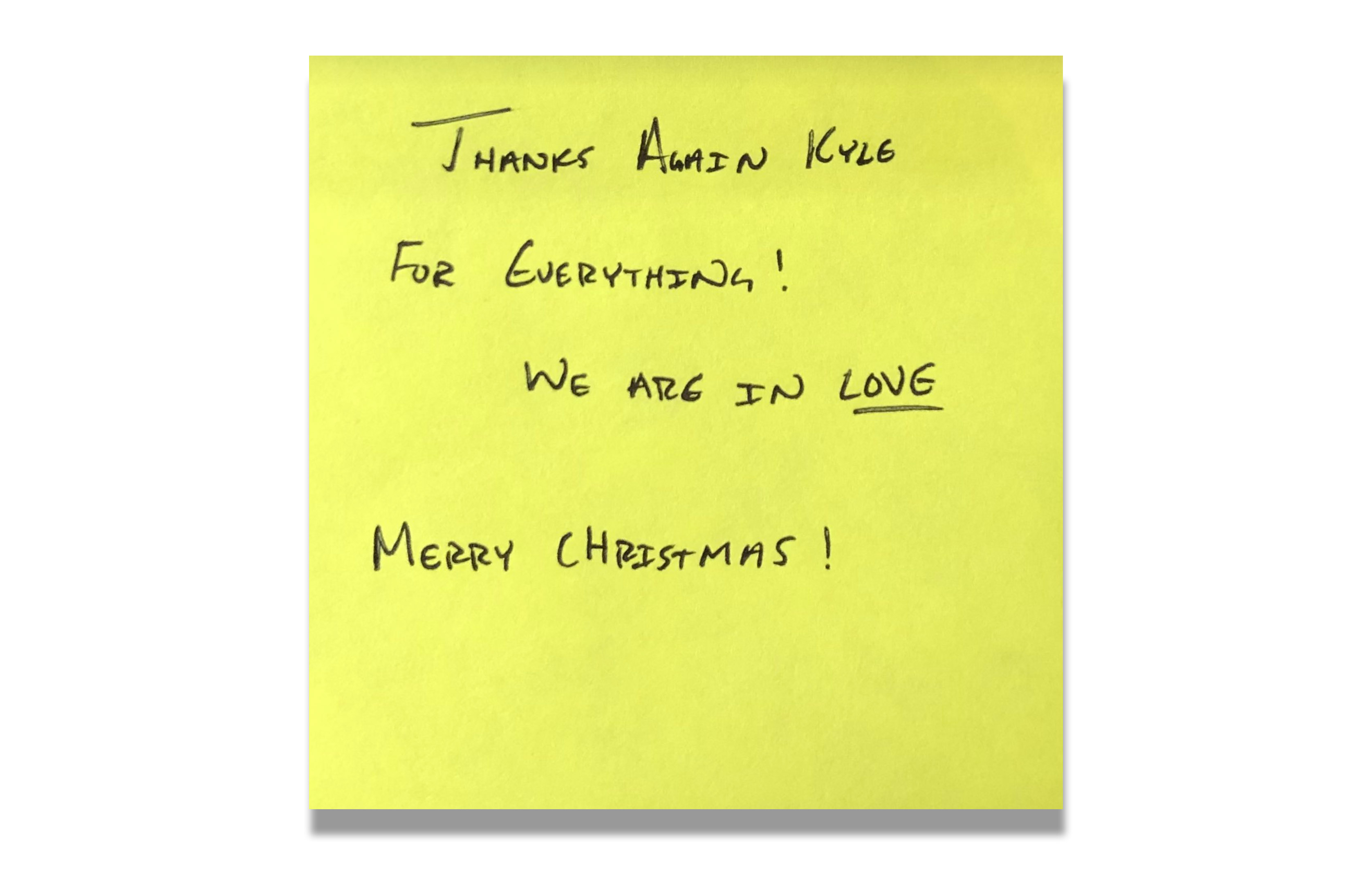
The impact is tangible, visceral, and obvious and I'm so thrilled to have the honor of being part of this project!
I'd be honored to be part of yours too!
