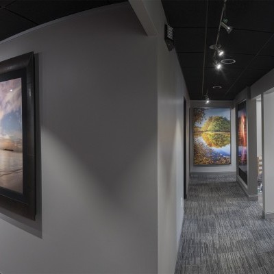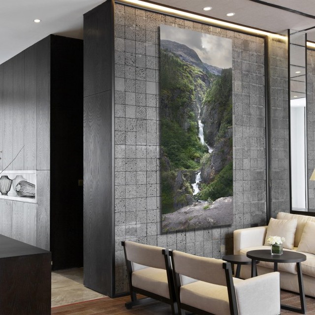
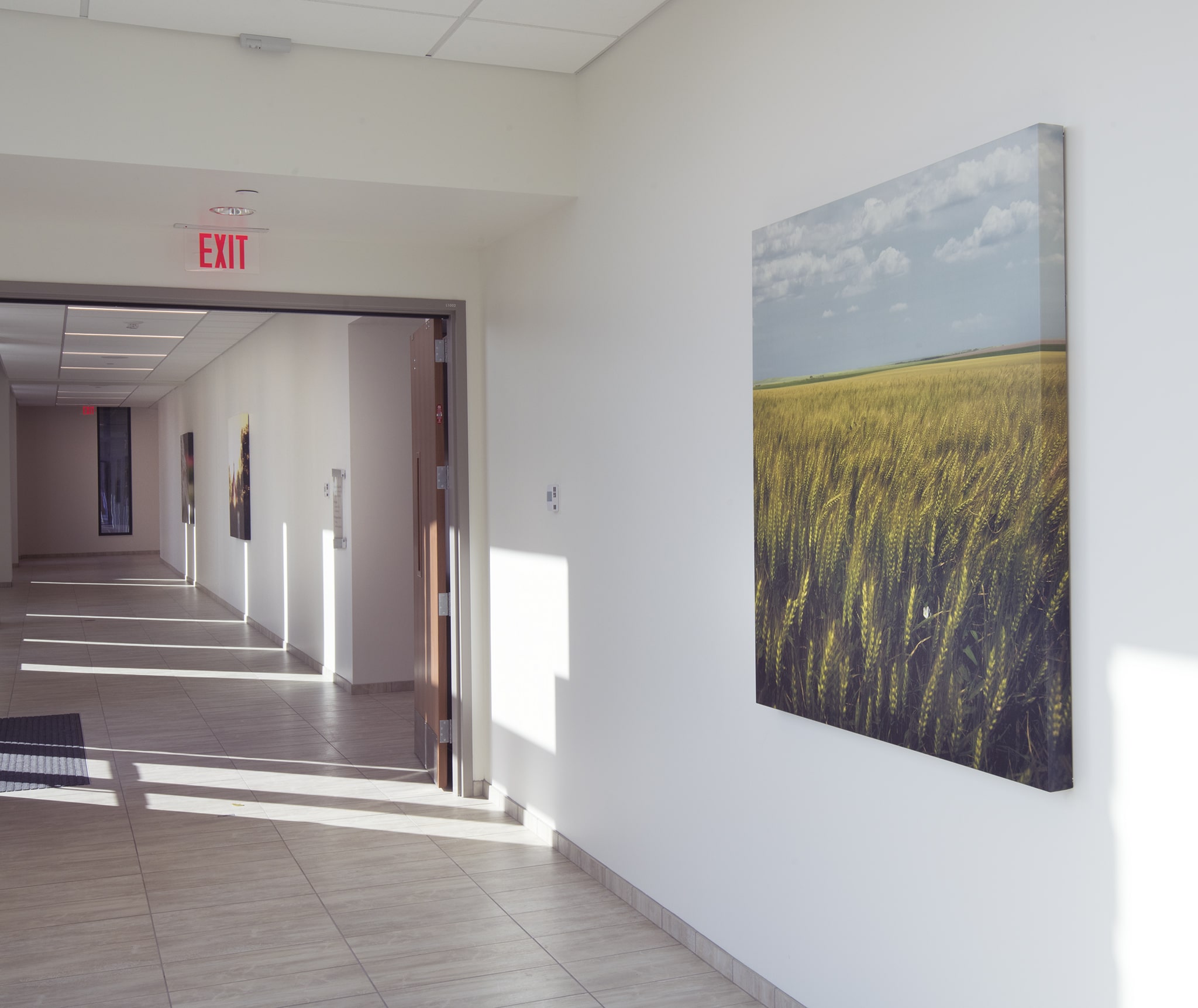
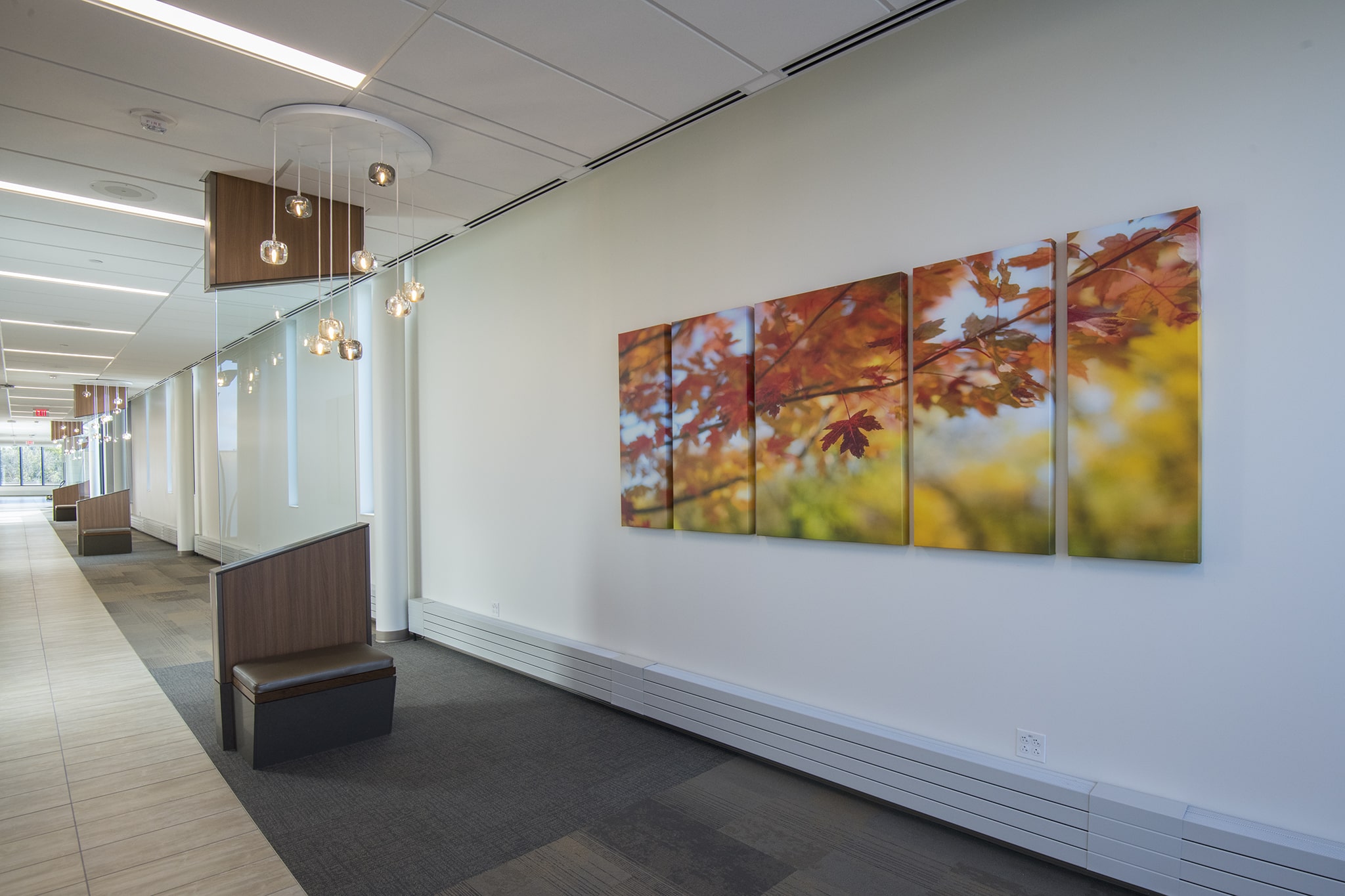
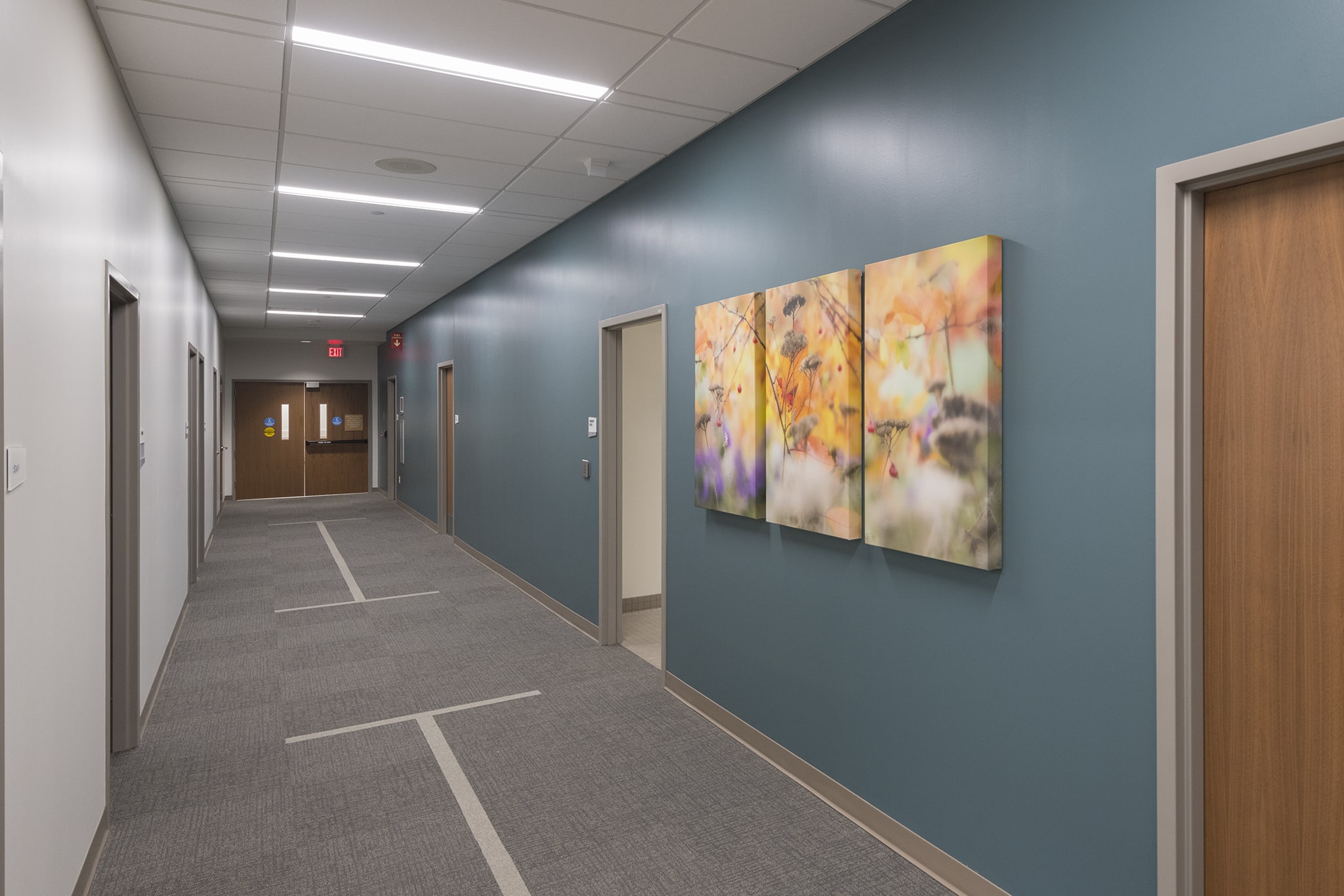
As we continue the tour of this amazing hospital space, we can walk down this huge, bright hallway that certainly brings the outside in. This is especially useful during some cold winter days.
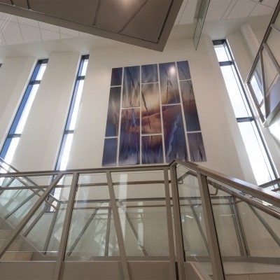
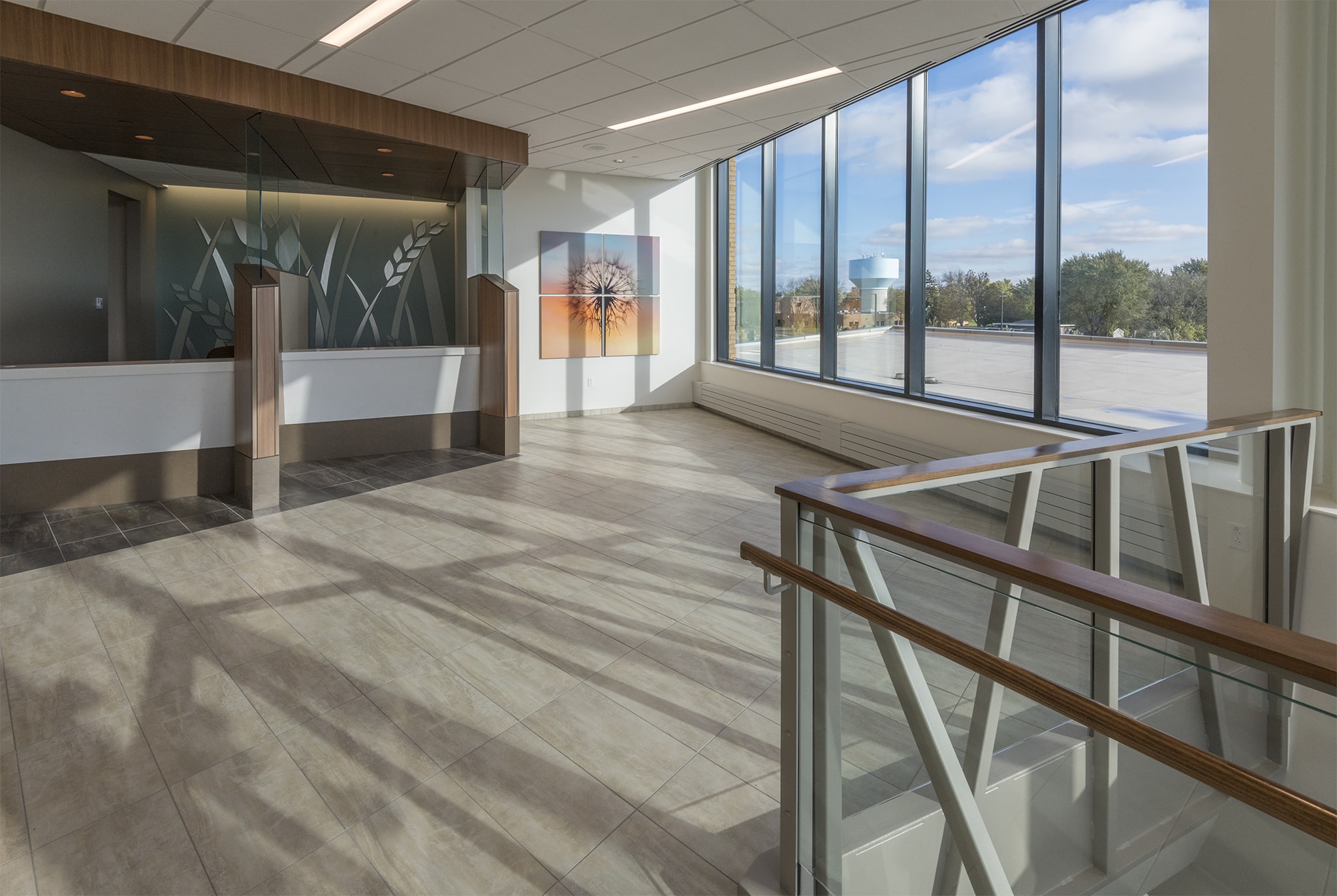
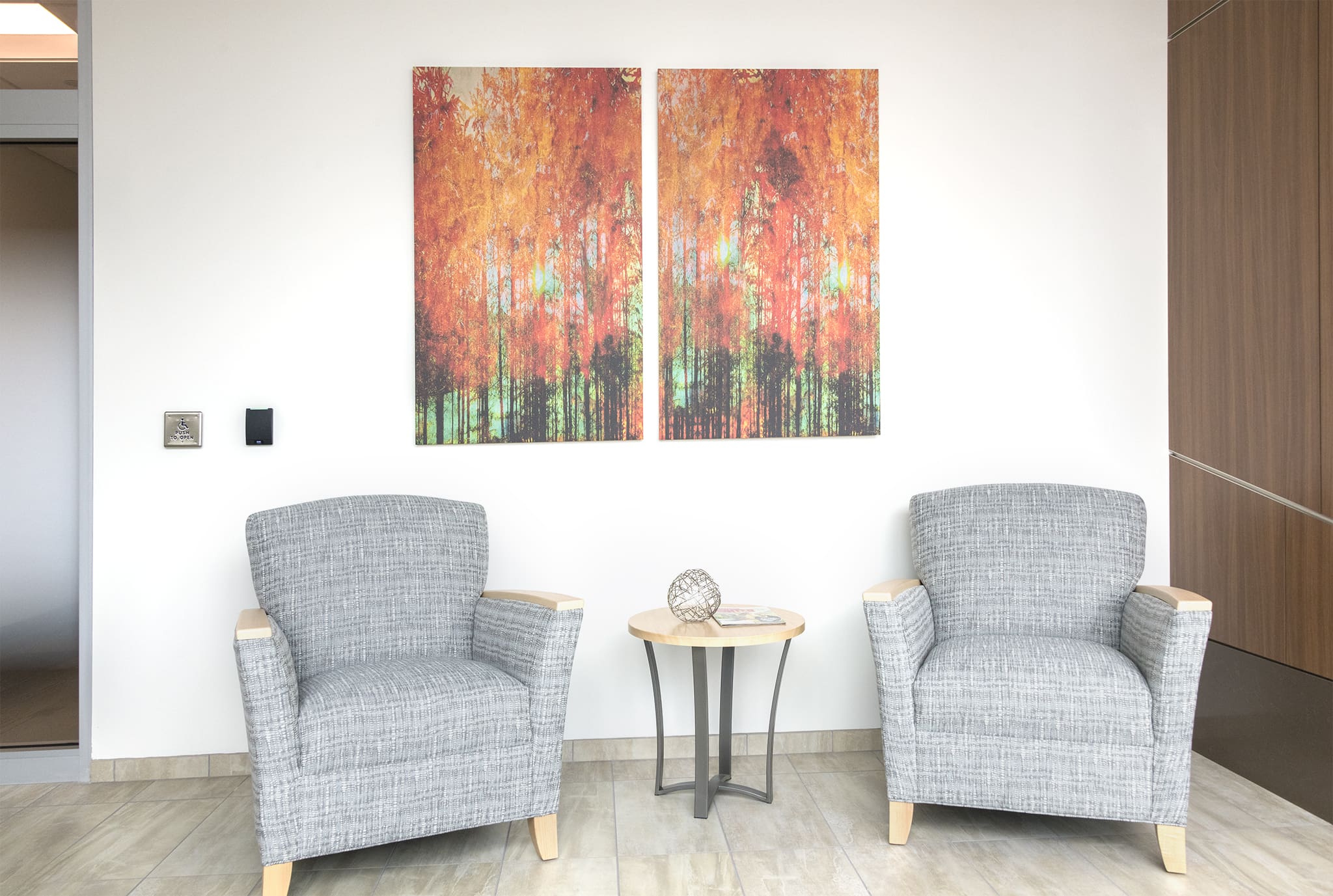
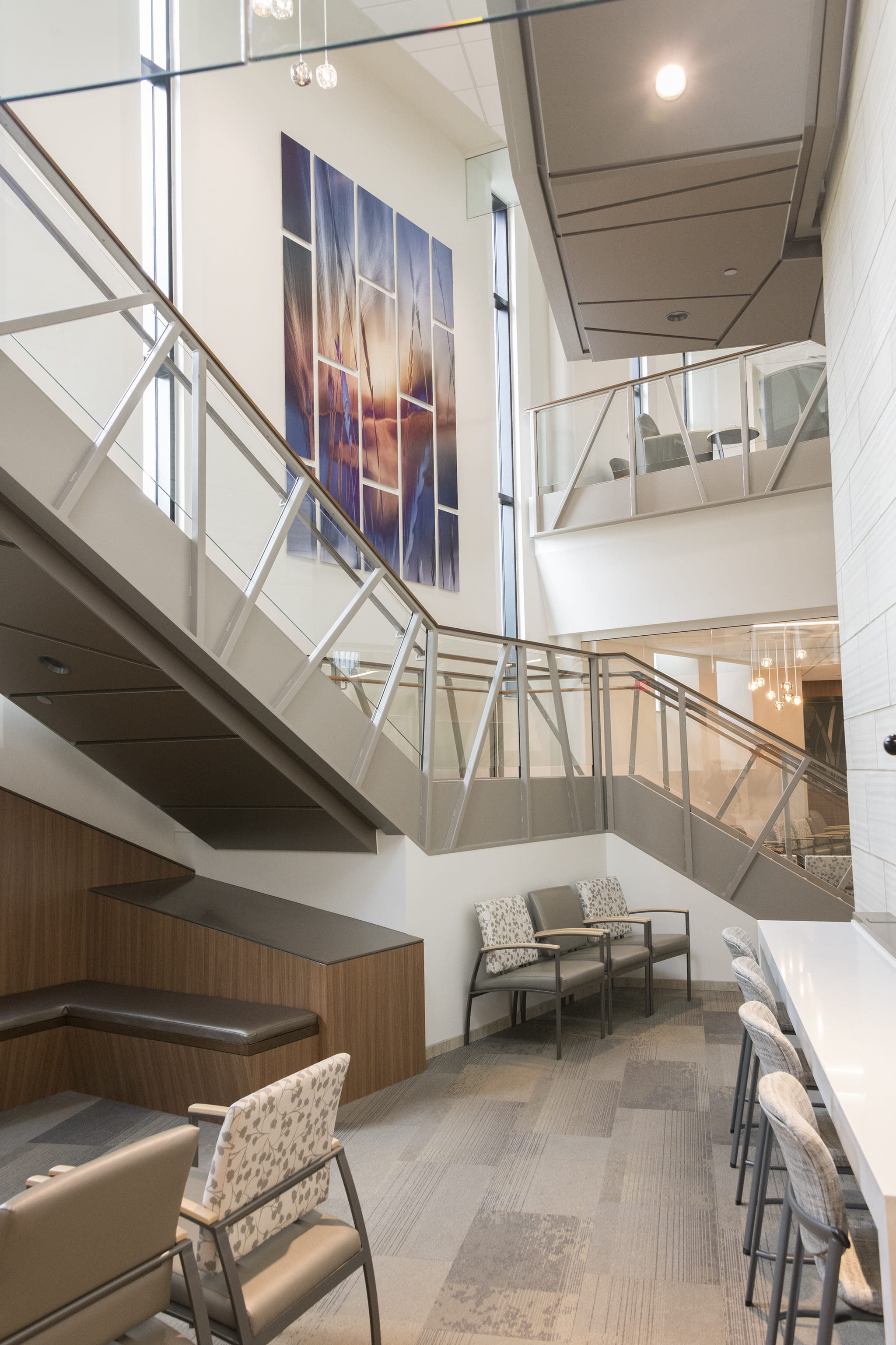
If we head upstairs, you'll see we wanted to splash some color on the wall with an unusual shape and configuration of panels.
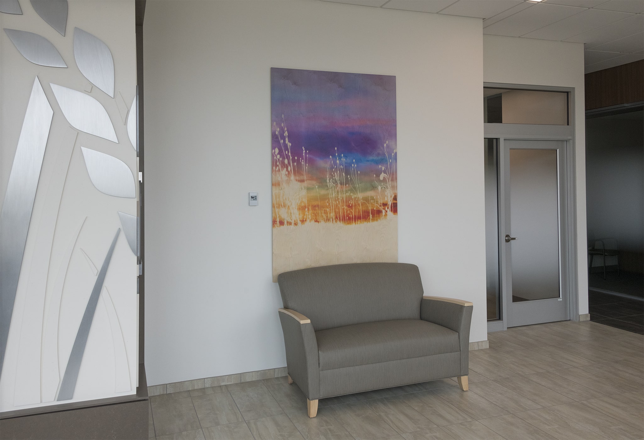
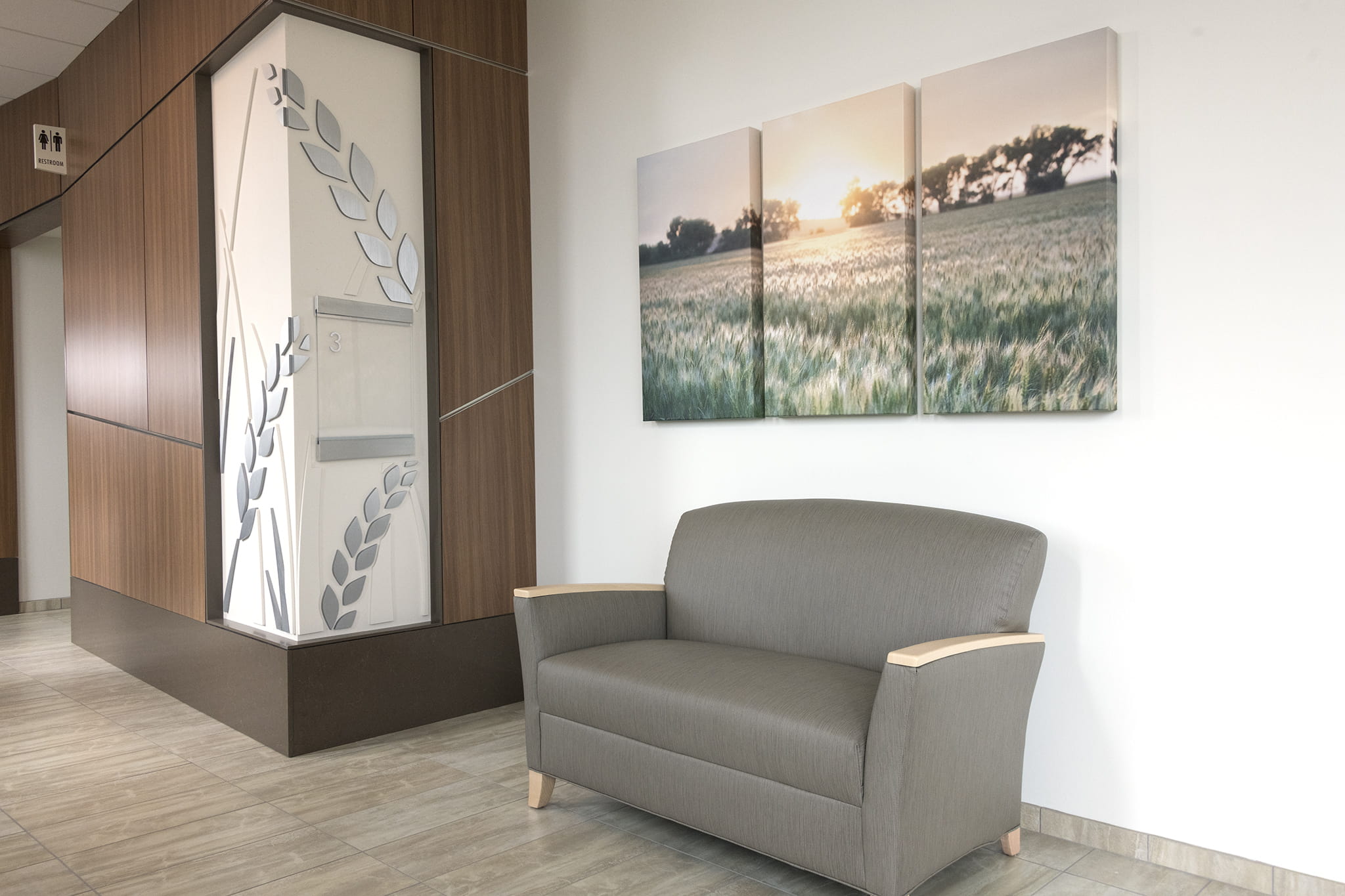
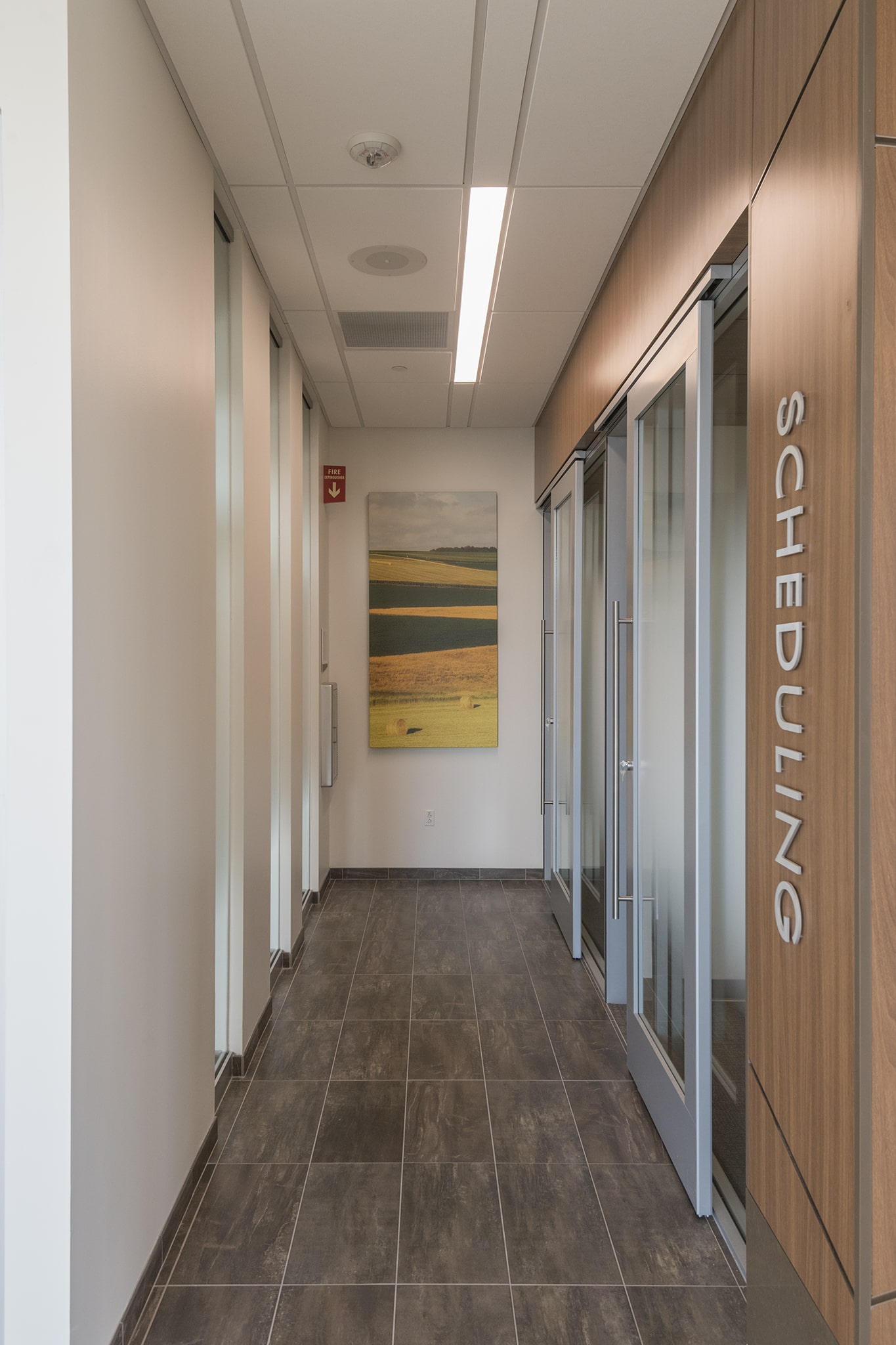
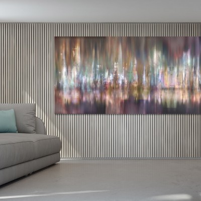
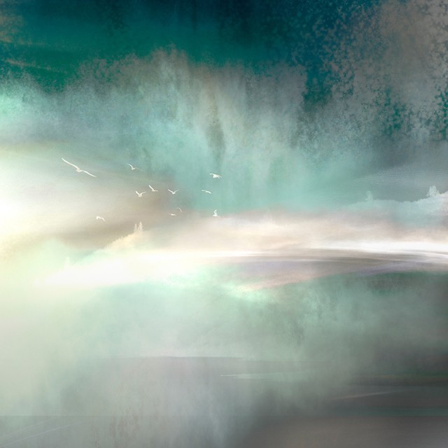
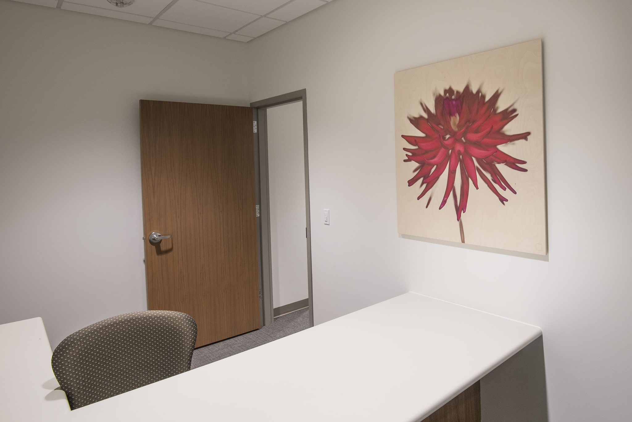
As we explored some ideas for the scheduling rooms, we came to the conclusion that the juxtaposition of a soft, airy image combined with a grittier substrate like wood could be mesmerizing.
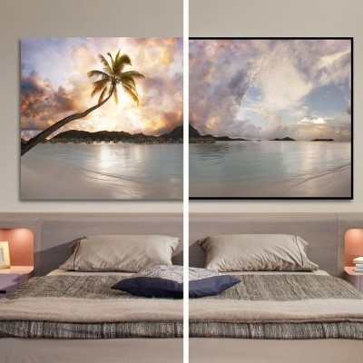
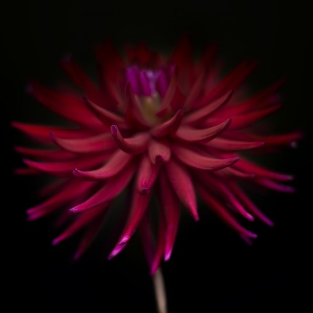
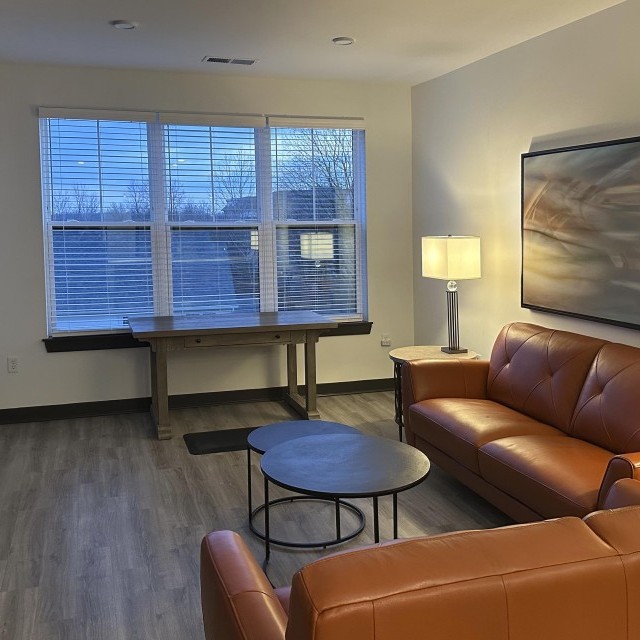
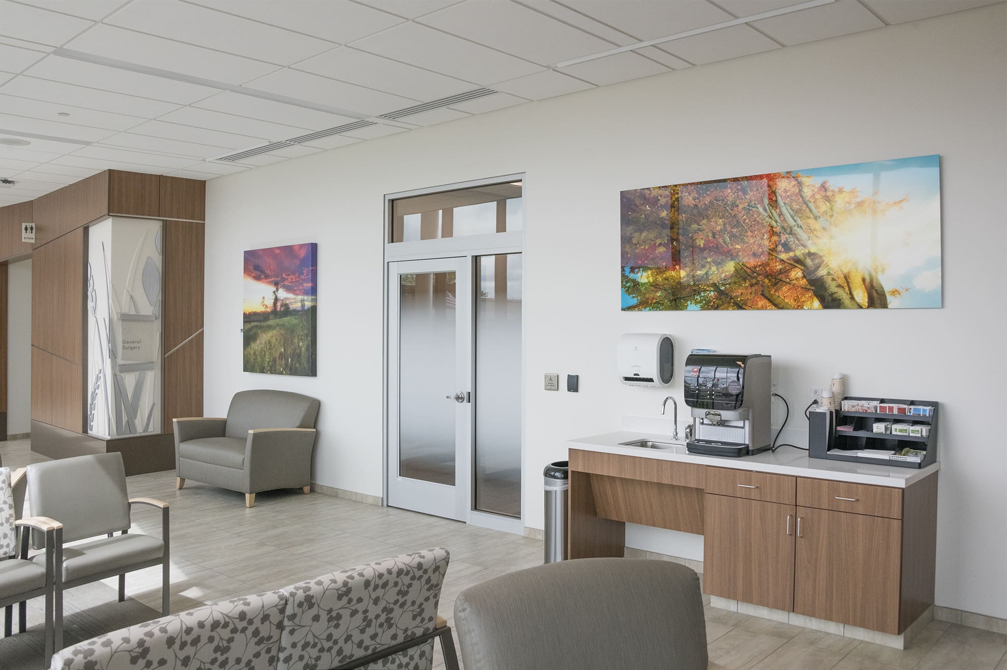
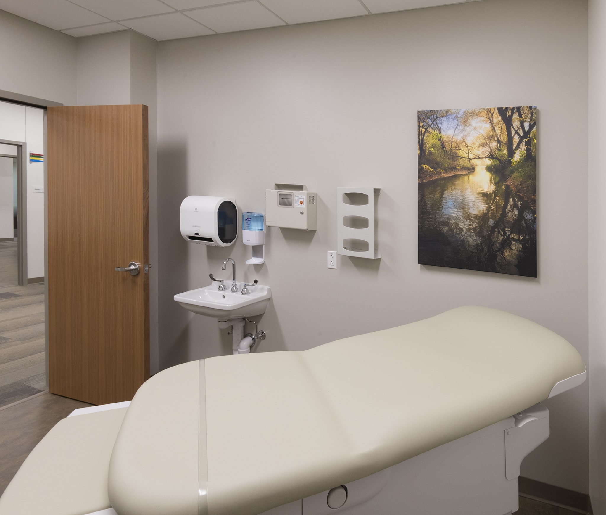
Of course, the fun part was outfitting each patient room with a visual distraction. We changed up the sizes and shapes so that every single room was a unique experience.
As we go downstairs, I am reminded about how important the grand wall was.
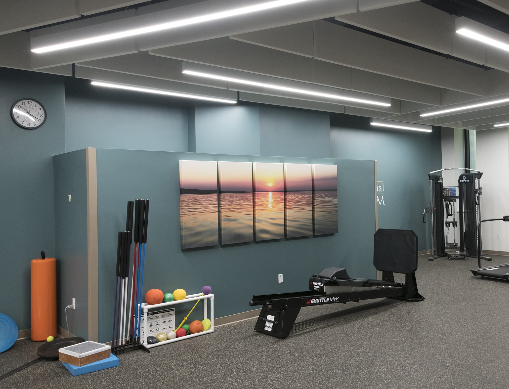
Want to see more? Make sure to explore the first part of the hospital art tour!
I extend my special thanks and most sincere gratitude for the team at Prairie Lakes Speciality Clinic for this fantastic opportunity to explore, uncover, and install some unique art concepts!
Health facilities often pursue more traditional creative art concepts, but I will continue my mission to rethink and reshape environments for patients that long for wonderful visual distractions.
