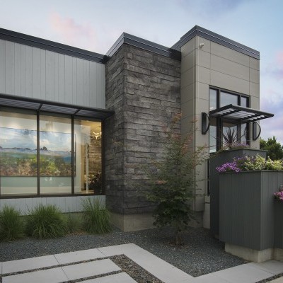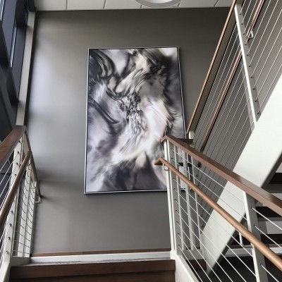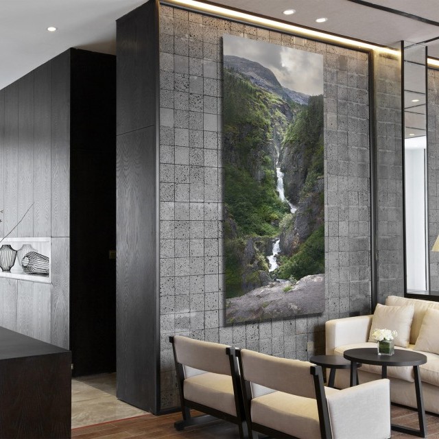
I'm excited to show you a recently completed dental clinic in Sioux Falls, Dental Essence, that started from the ground up when it was just a shiny floating abstract concept in the air... but is now reality.
It was a true pleasure to be involved with the architecture, floor plan, and design that went beyond the art and finishings of the space.
Major goals of this new dental office were identified:
1. Create visual impact to make people forget this was a dental office, yet offer subtle elements to reinforce the brand of Dental Essence.
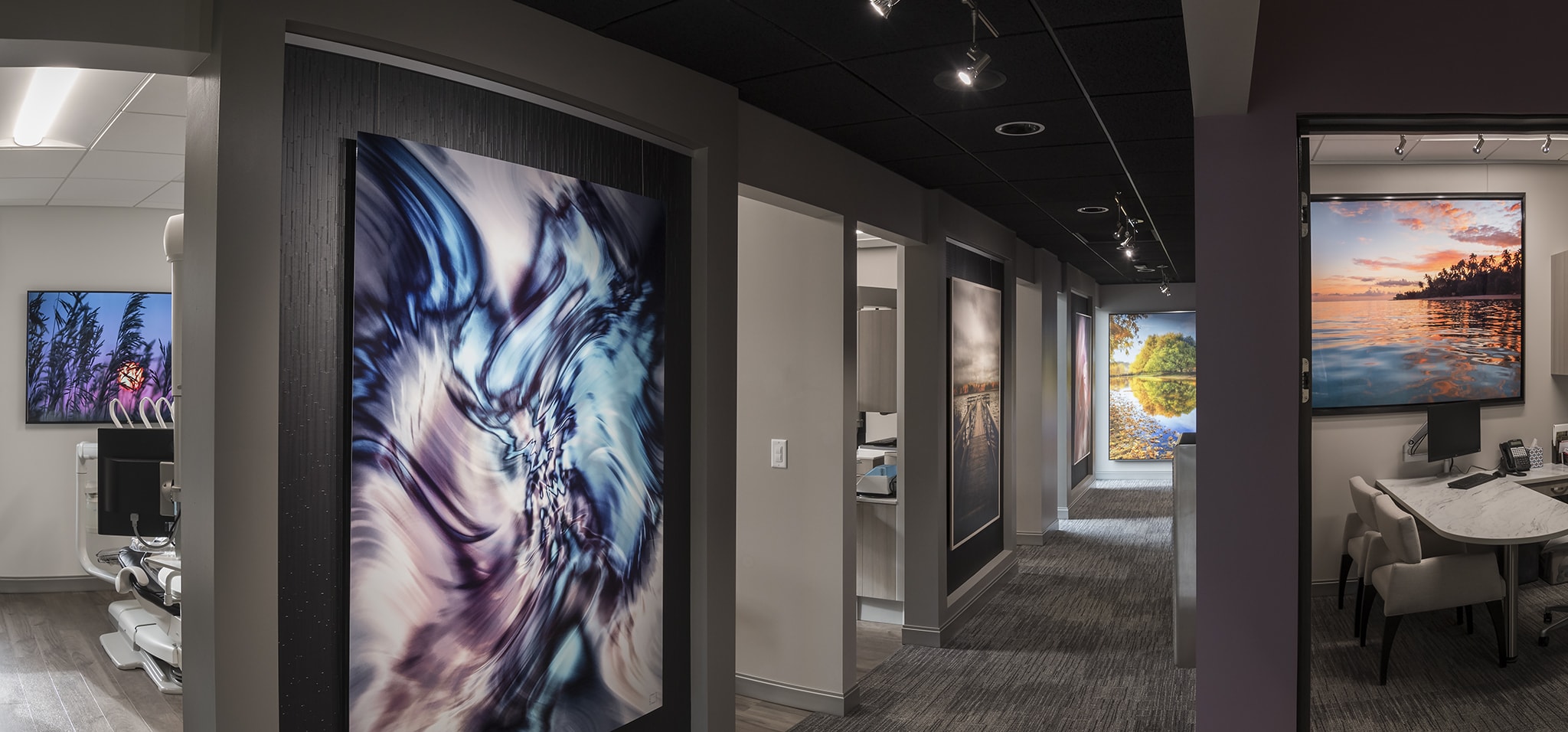
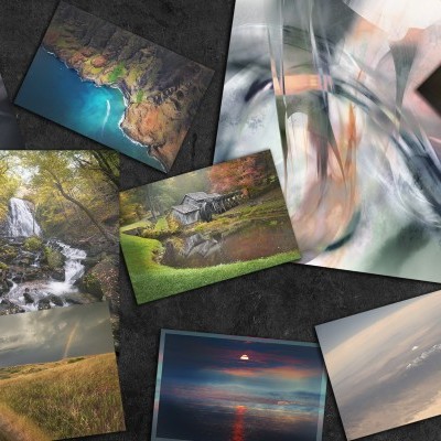
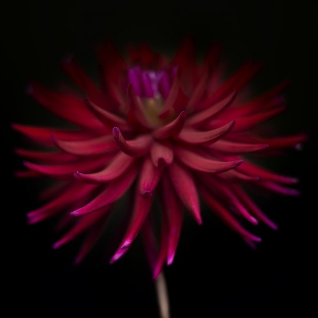
2. Conjure tranquil emotions by carefully placing a mix of nature scenes in a variety of substrates.
3. Offer elements of surprise with dynamic and colorful abstracts.
4. Add unique installations of artwork throughout the space from reception area, to halls, all the way to treatment rooms.
5. Display visual, dramatic escapes by using images that were both familiar, but also went beyond local "flavor" to stir curiosity and wonder.
6. Utilize technology to create displays that could change instantaneously and keep the space fresh long-term using new visuals.
Yes, this all sounds a bit dramatic and artsy, but when it comes to creating a space that has a strong first impression and feeling, I take it seriously.
Here are some ways I believe we successfully achieved the mission:
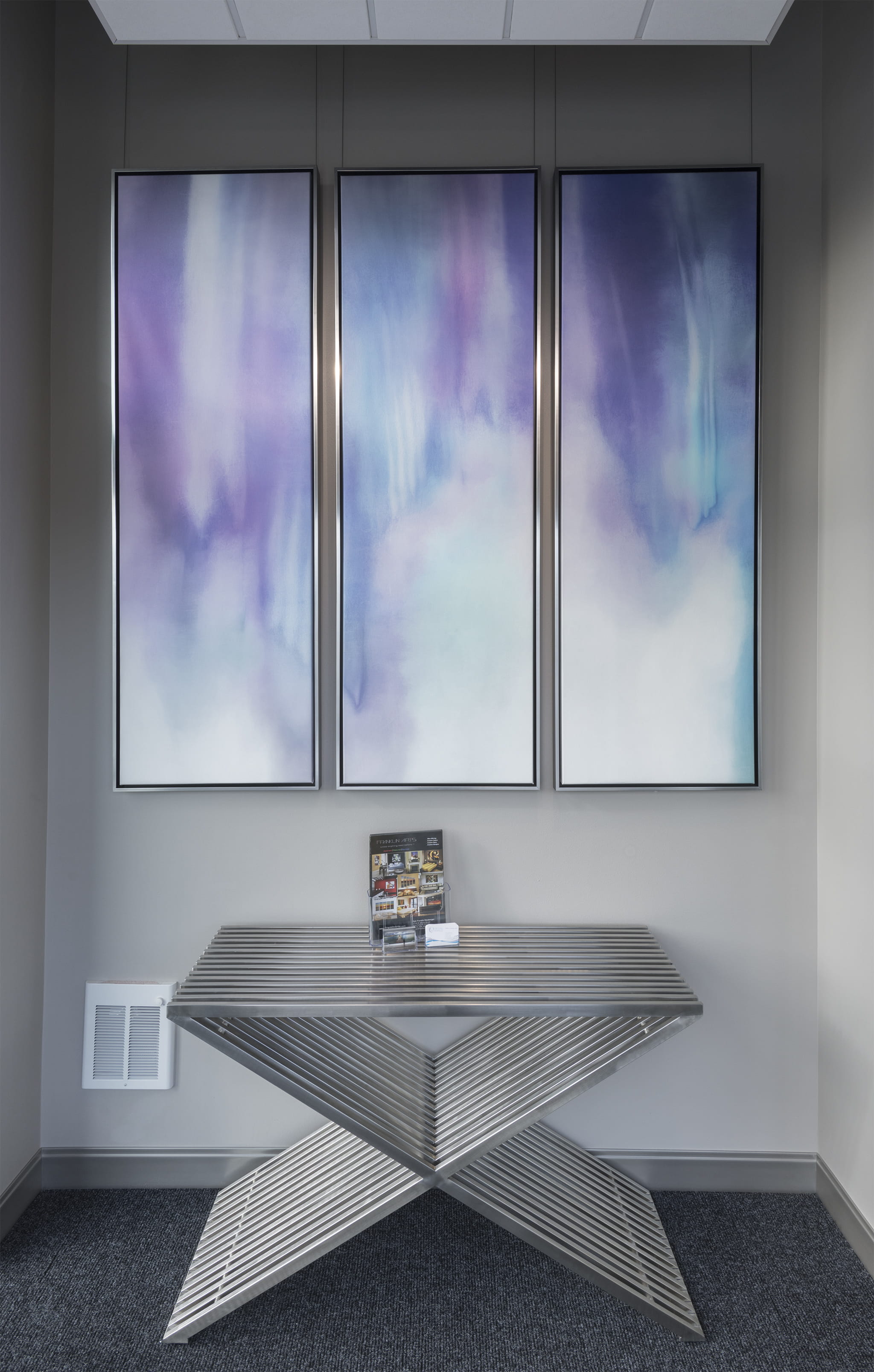
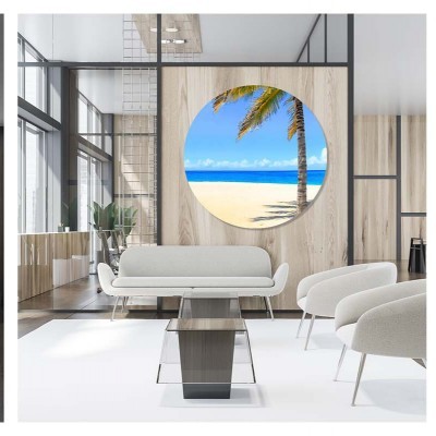
The light from the windows keeps the mood bright, while the tall, slender silver frames of the artwork shine to make them pop and tie them in with the table below. It's a welcome message saying, "This space is a little different to what you're accustomed to seeing."
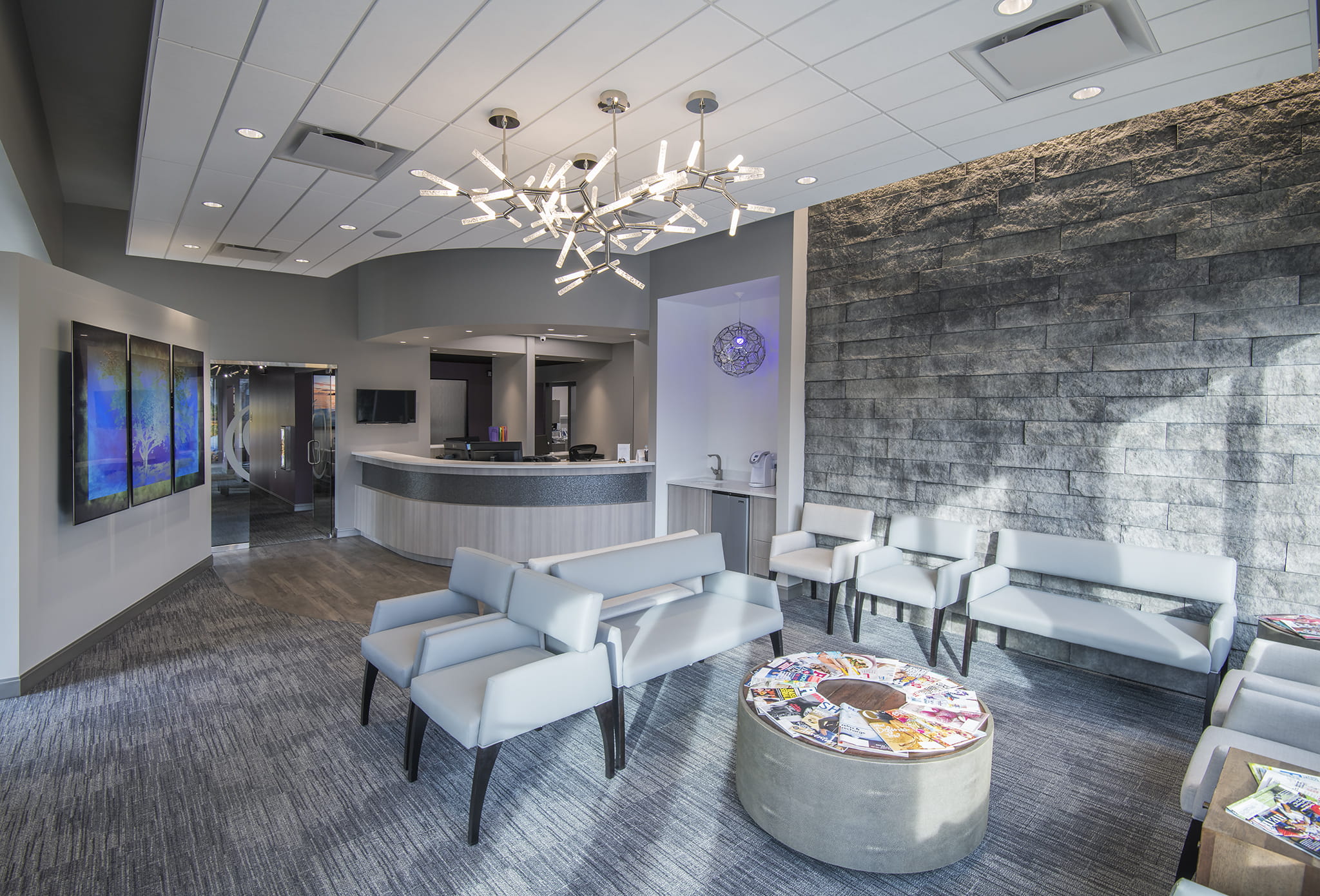
While it's tempting to put an artwork here on this large stone wall, empty space is sometimes the better choice.
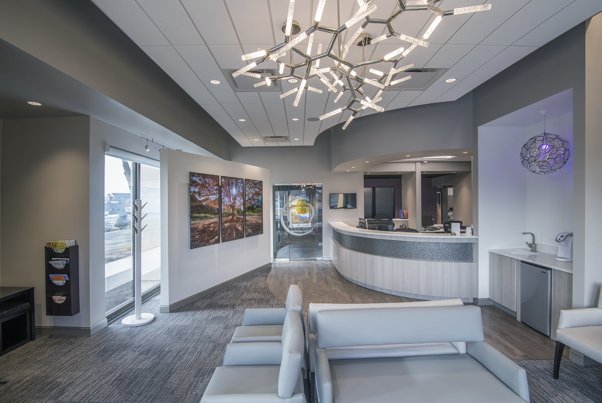
The space is filled with parallel lines to give it a modern flair, so these four Kryptonite lights from Modern Forms were placed in the center of the reception room. It is a carefully placed visual interruption to give the eyes a surprise. Light and shadow is the art above the beverage station, with an LED color-changing bulb to leverage colors to celebrate holidays, special events, or simply accent the brand's colors, like in this case.
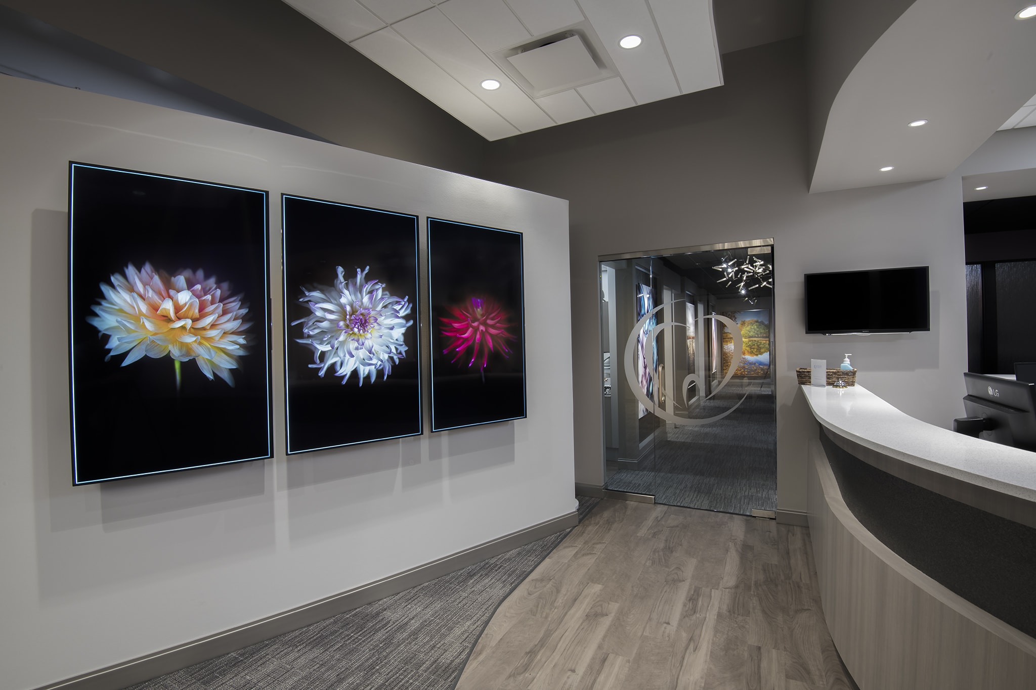
What's the best way to create harmony in a space? What is the best way to easily change the artwork at any moment like magic? The answer is an idea that smacked me in the head one day. Rather than place a static multi-panel artwork, we decided to use digital monitors instead.
A clear glass door with a subtle branding element hints at what's next beyond it. Many thanks to Pete at Pride Neon Signs for installing this subtle piece that has packs a punch.
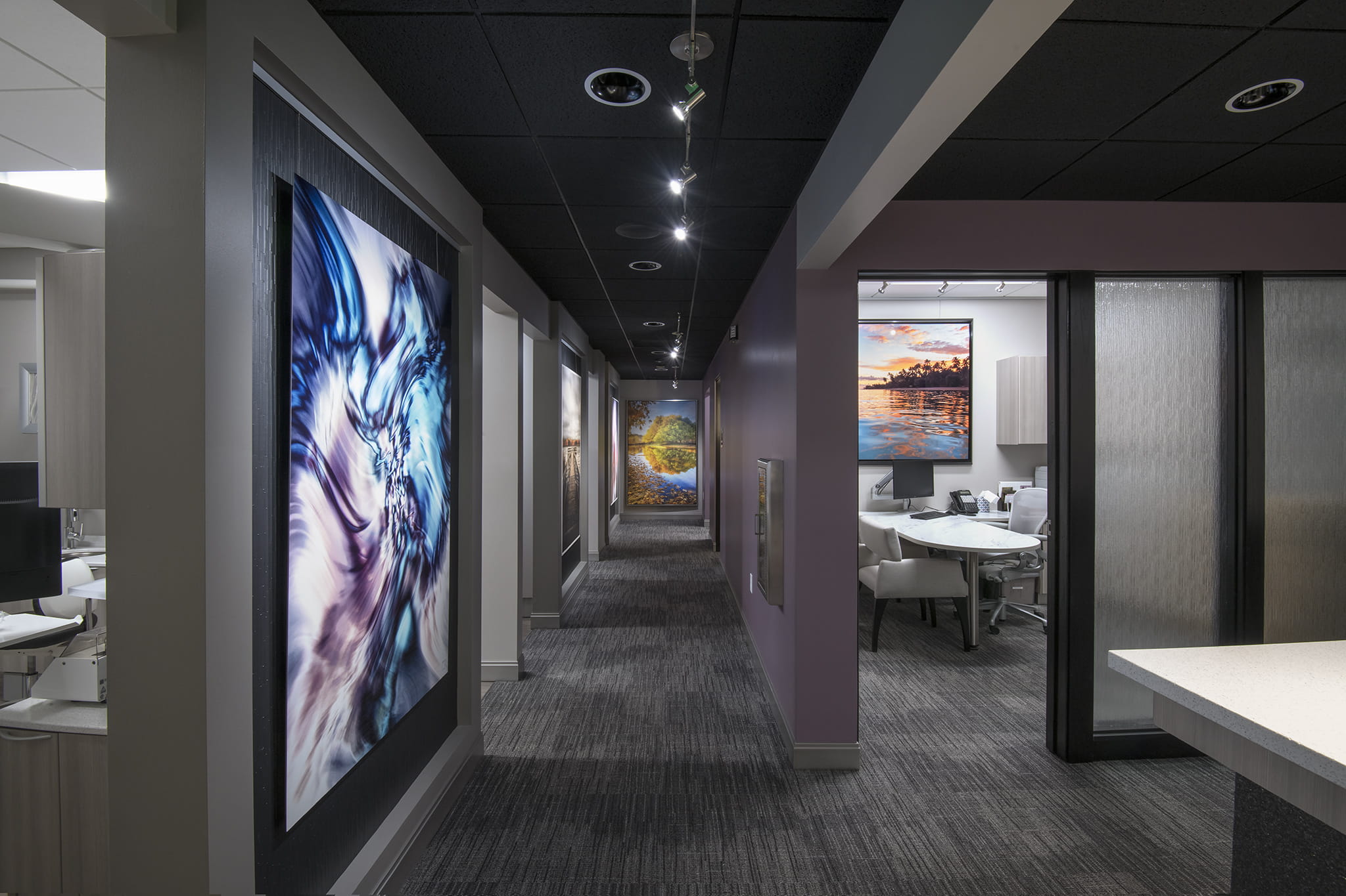
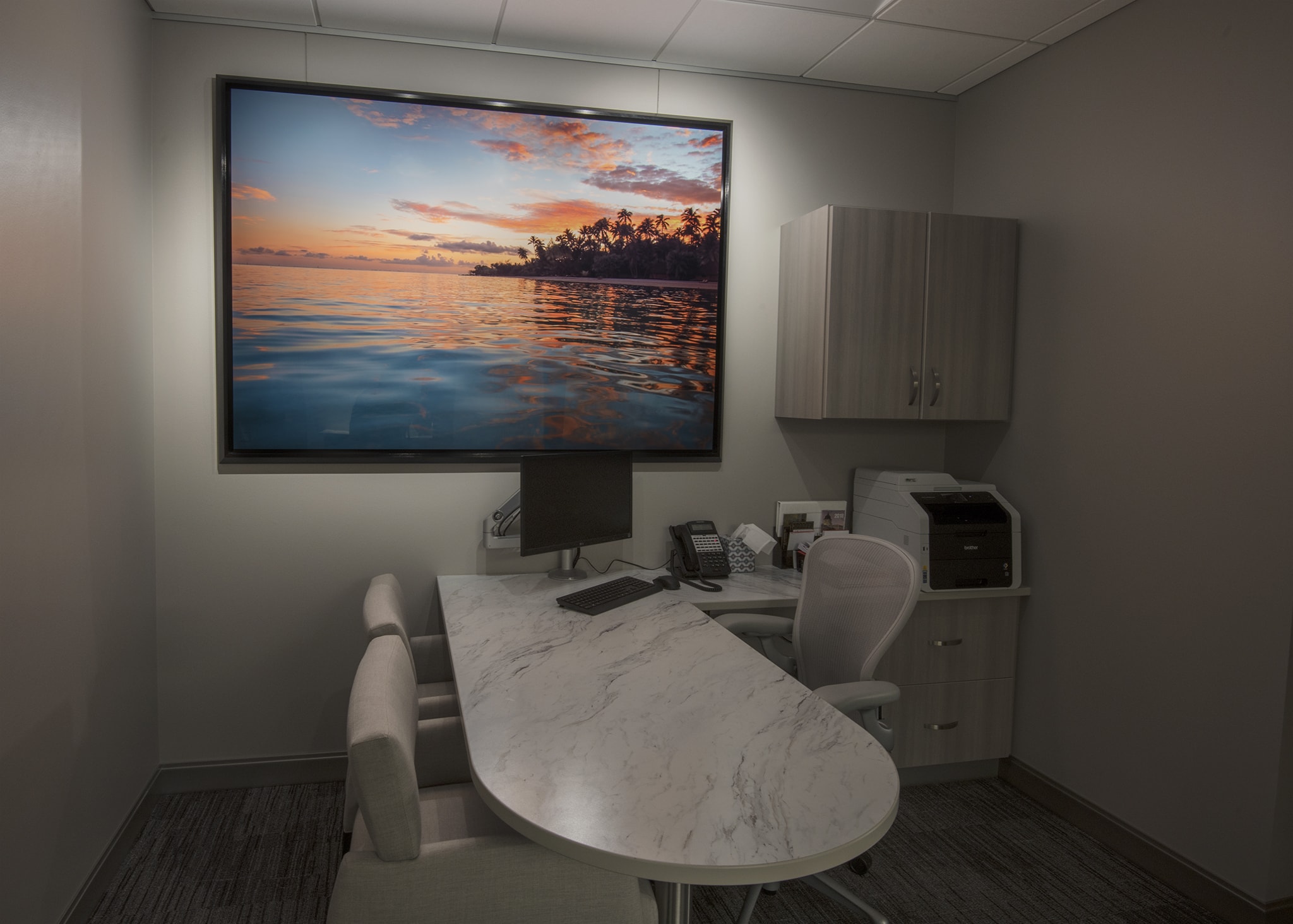
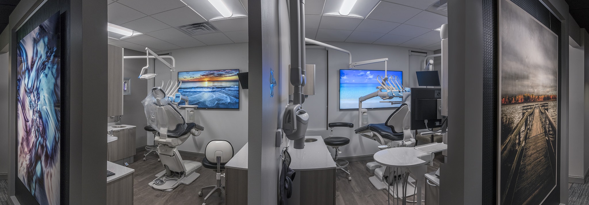
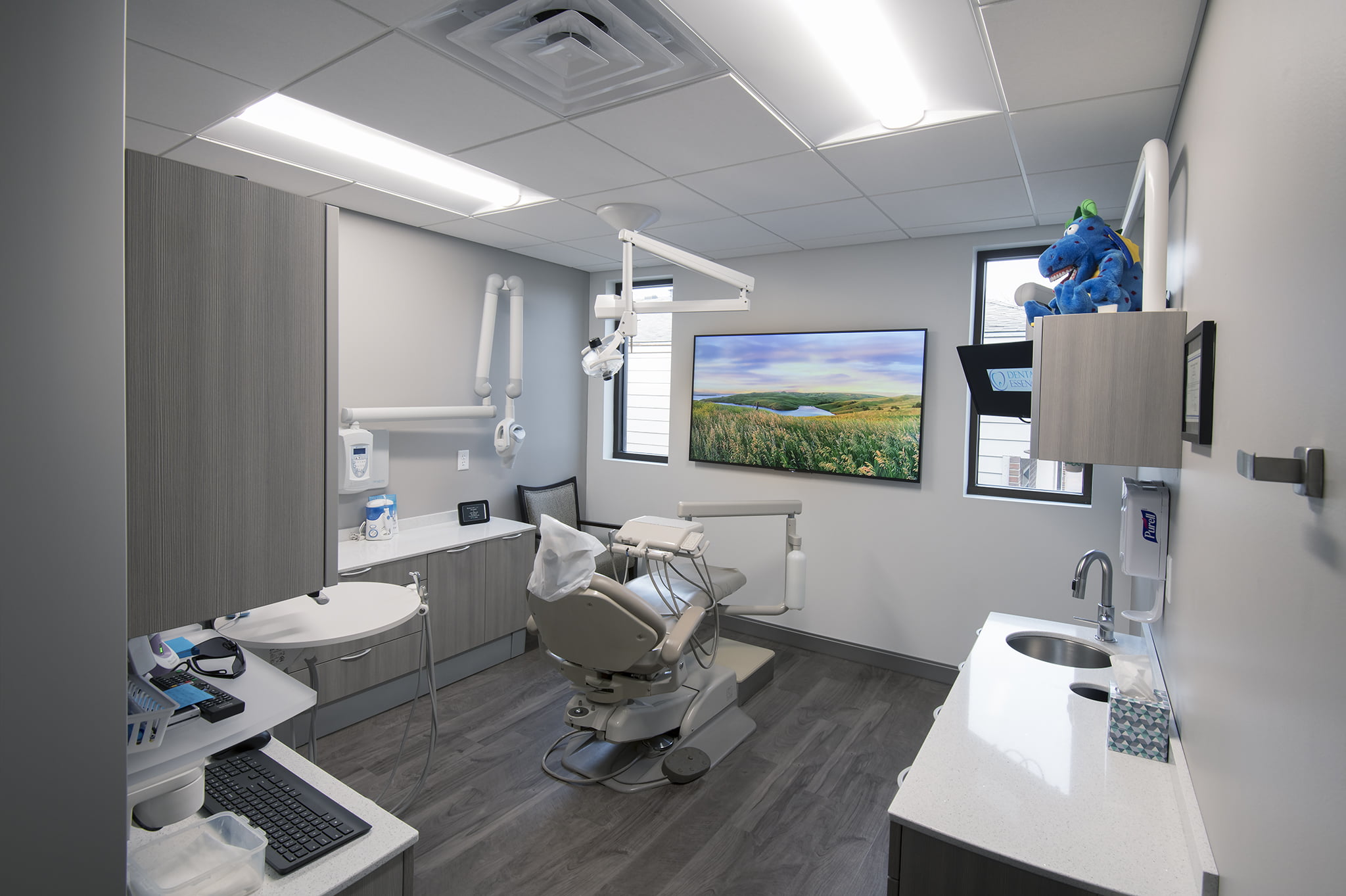
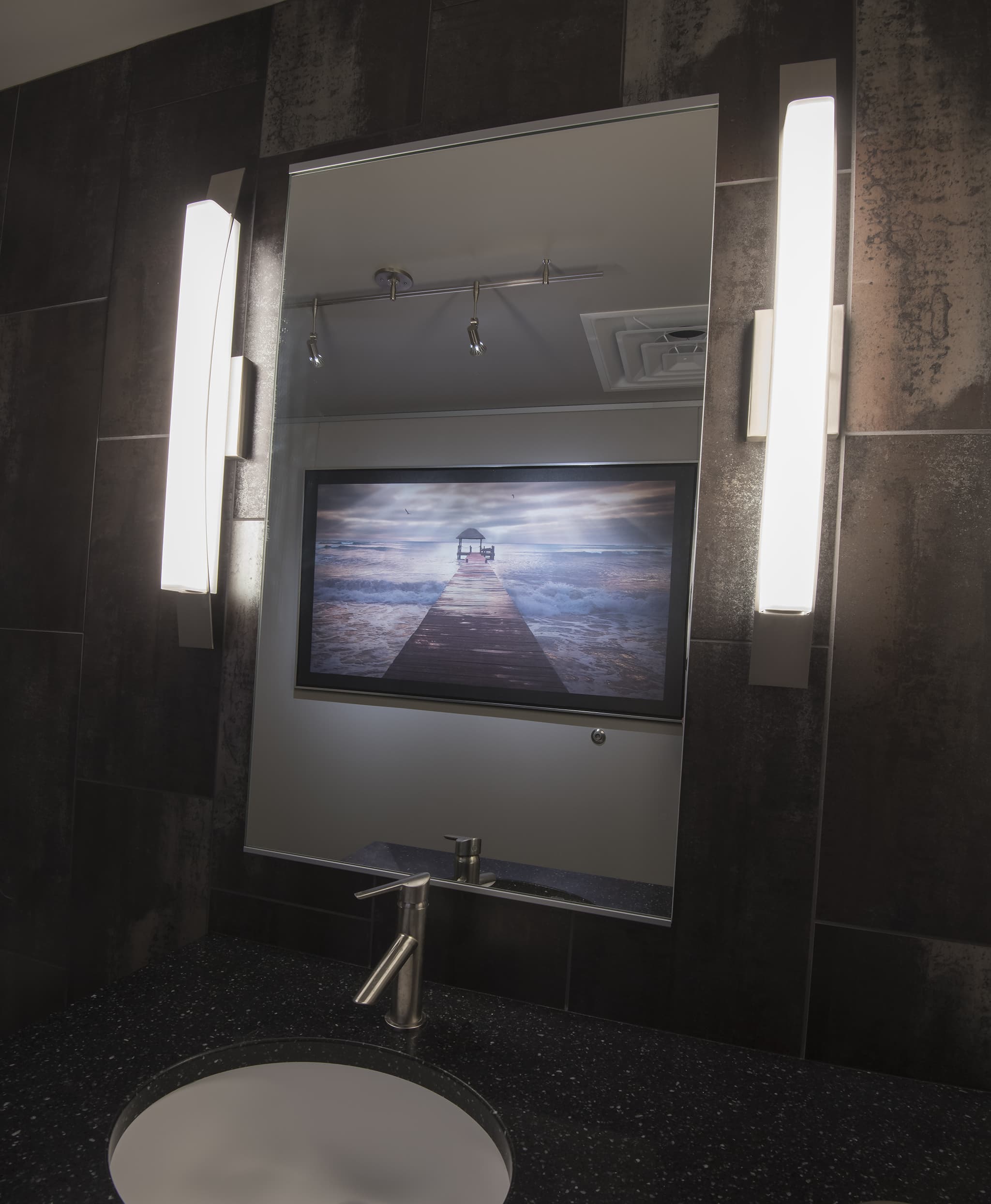
No space in this dental office was overlooked.
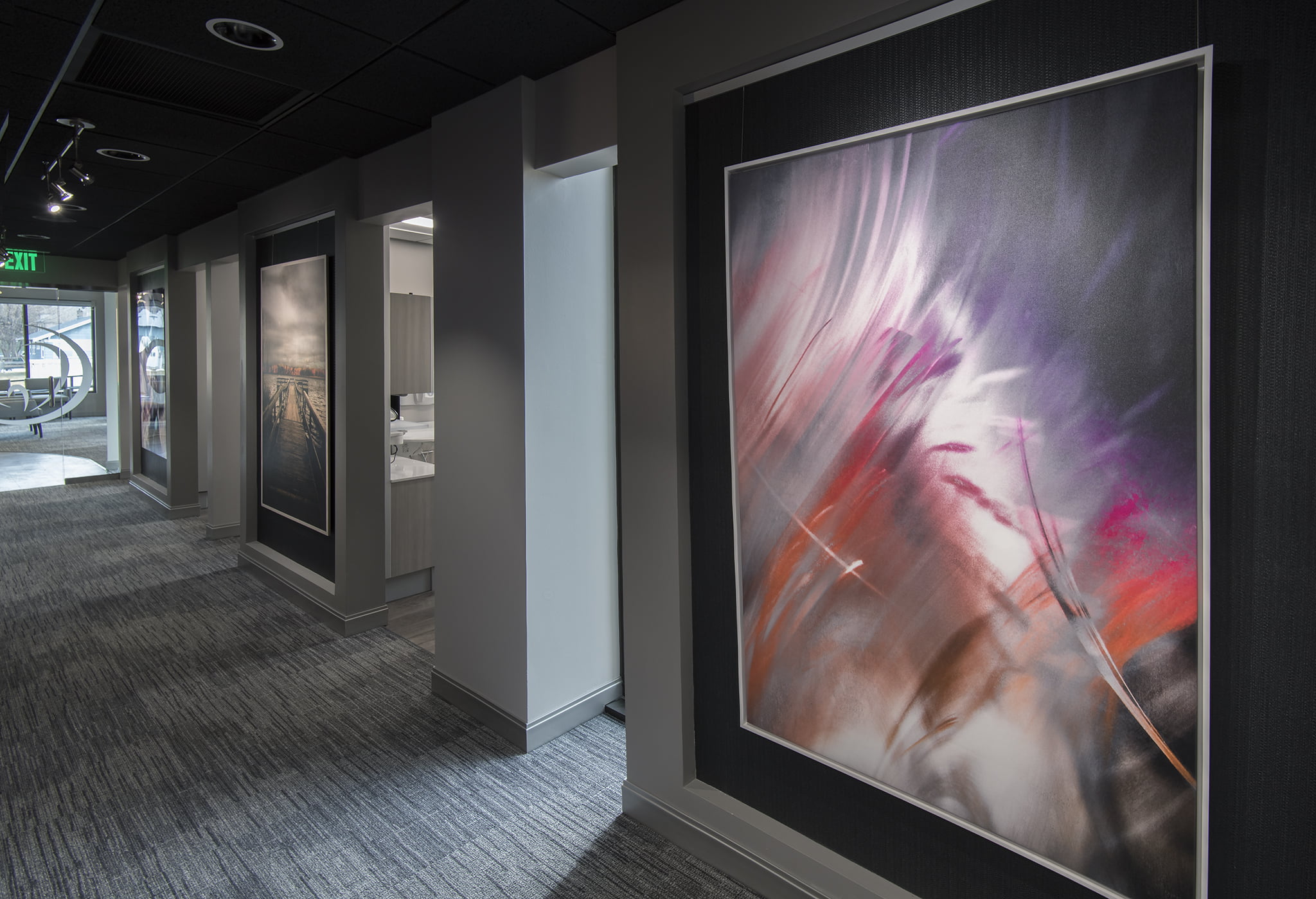
Each head wall serves as a perfect frame with a subtle, dark, three-dimensional vinyl wallpaper from Wolf Gordon to serve as a backdrop for each image. Each wall could have been the same, but what fun would that be? A total of eight papers were selected to sprinkle the head walls with variety.
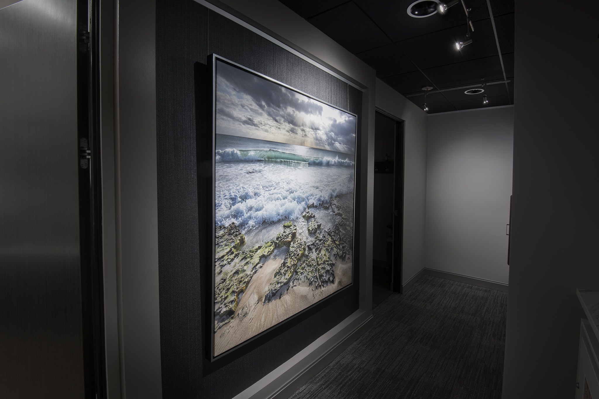
One of the best ways to enhance visual impact is lighting. Wrong or insufficient lighting is a mistake.
Not this time. Ridiculously extensive research to find perfect gallery lighting went into this incredibly important selection for the dental office.
These are ultra vivid SORAA lamps, one of the cleanest LED lights available today, and that's what we used throughout the space. All the subtle nuances of each artwork is revealed.
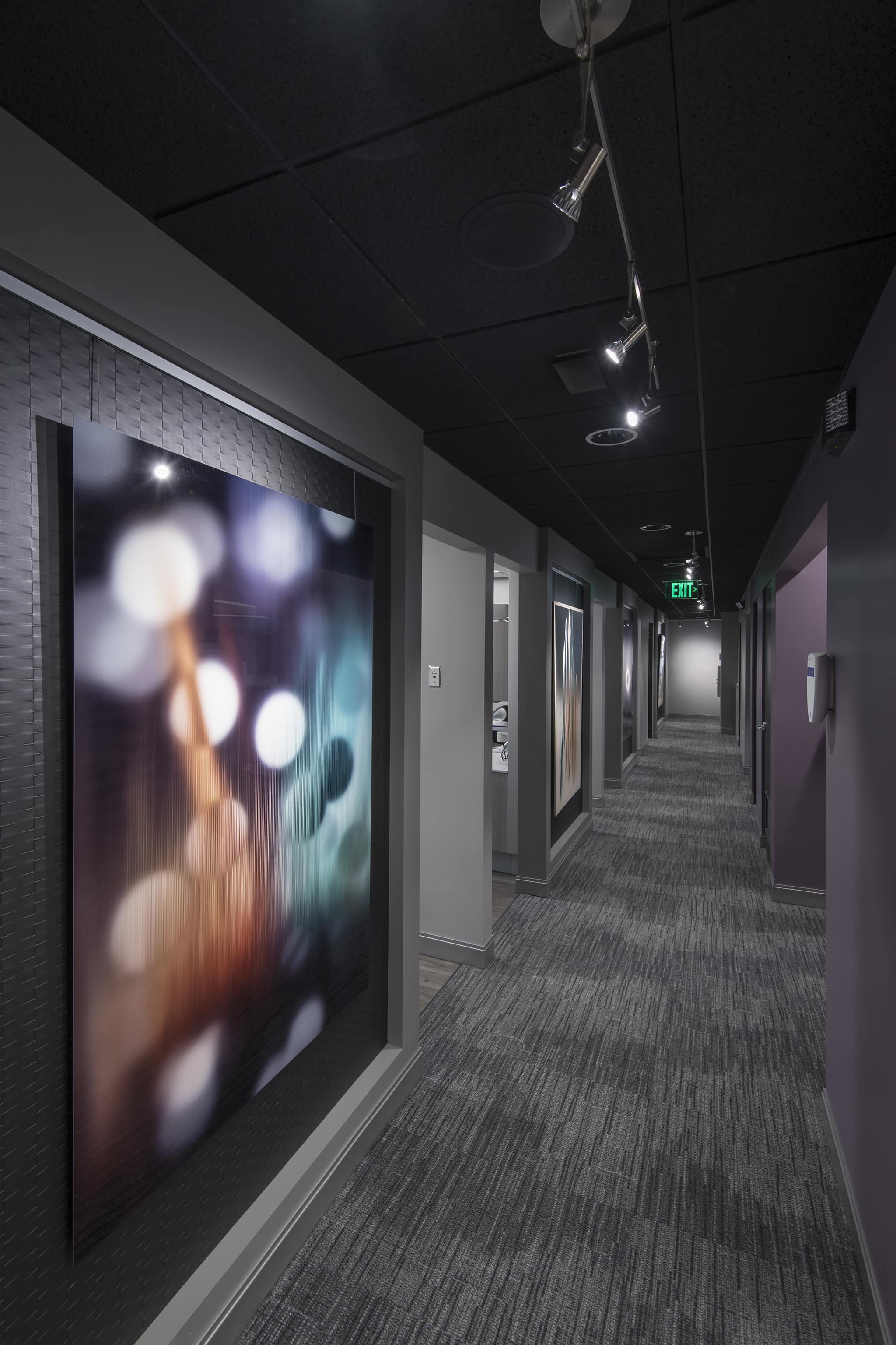
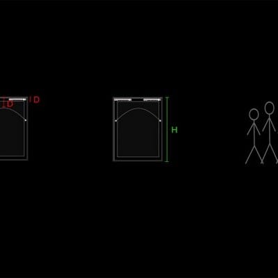
Each artwork is mounted using these art tracks form AS Hanging Display Systems. It gives the space a sense of intentional art design and allows the artwork to be changed out swiftly later whenever the time arrives.
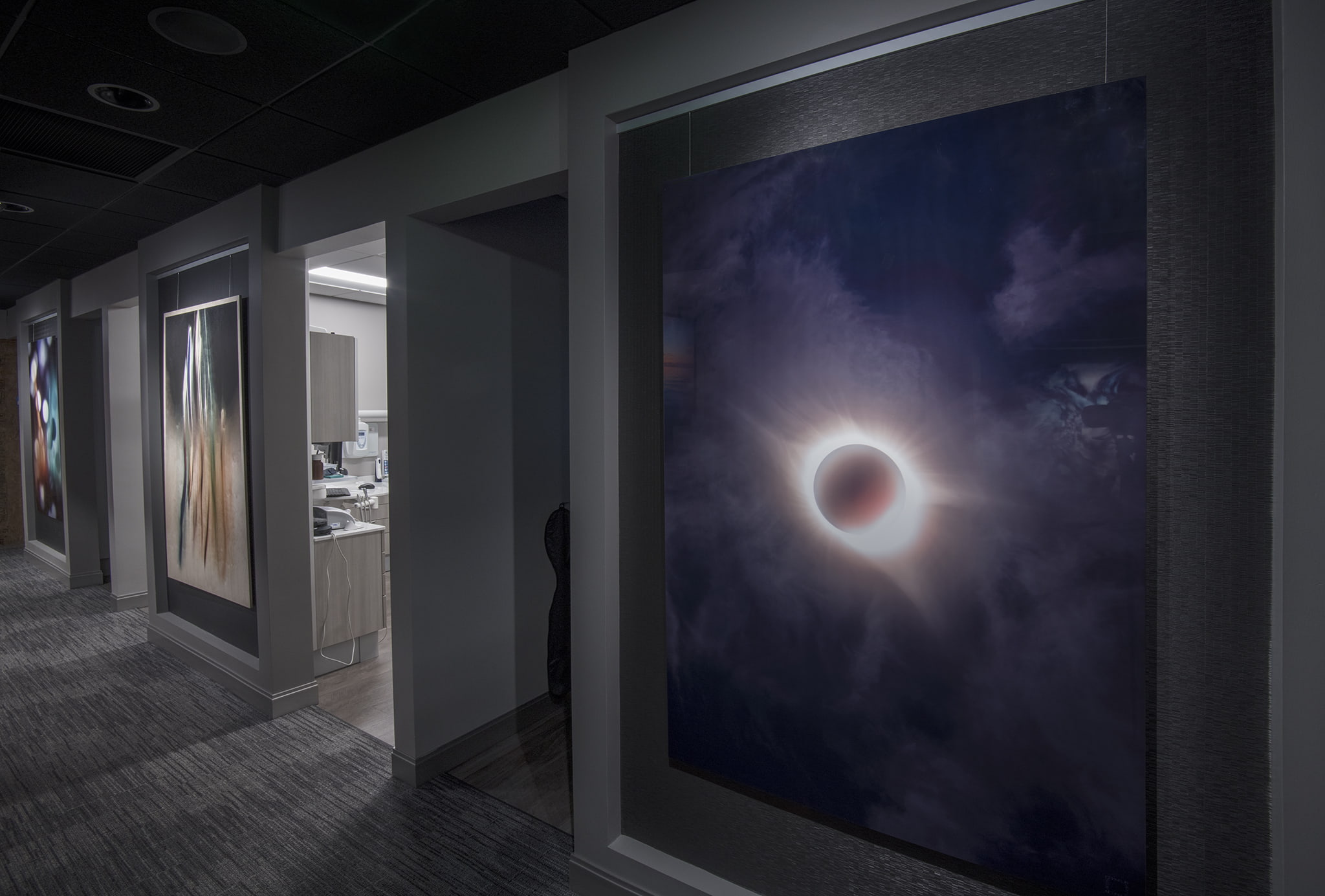
Want to see the final phase of this amazing office art project?
I believe what made this a true success it that no shortcuts were taken. Every choice was mined in every instance, and every decision made was weighed carefully. All details were considered, and it's the smallest details that make me excited about this project.
The team was comprised of many and thanks to all of you, including the wonderful staff at Dental Essence, for all of your hard work through every phase of the transformation.
A special thanks goes out to Ryan Hofer at Unlimited Electronic Lifestyles and Ryan Hansen at Kota Systems for bringing in the technology to mend with the artwork. Additionally, thanks to Connie and Denise at Montgomery's for helping select the finishings to bring the grand vision all together.
