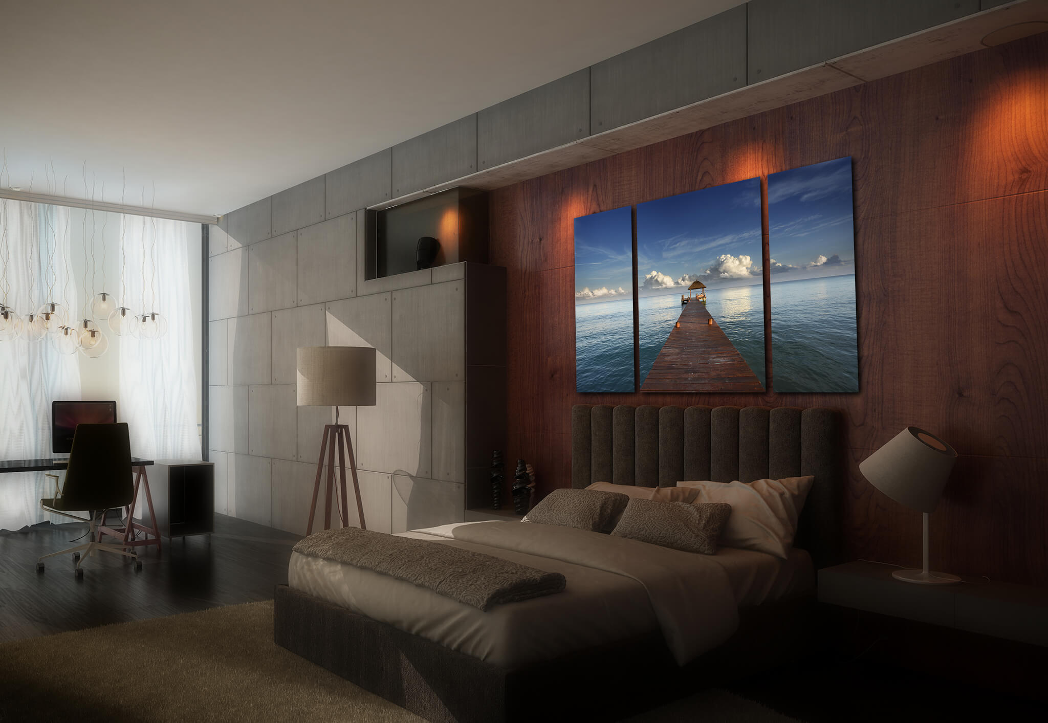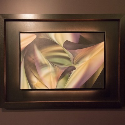
What image should I use to create a triptych?
Over the years, I've created hundreds of triptychs and have helped shape other people's pictures to be intriguing three panel artworks for their homes and offices.
What I've learned is that some images just simply work better than others. If you are seeking an incredible triptych masterpiece, I hope I can provide some guidance from my experience.
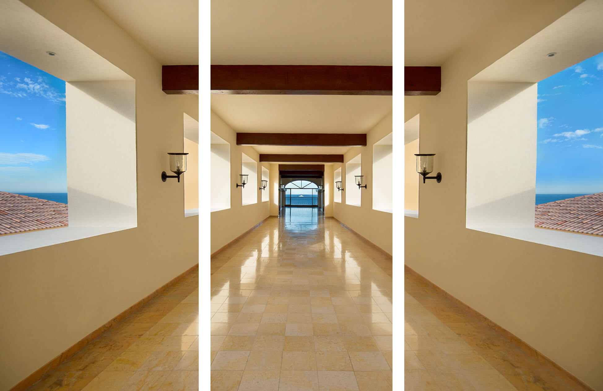
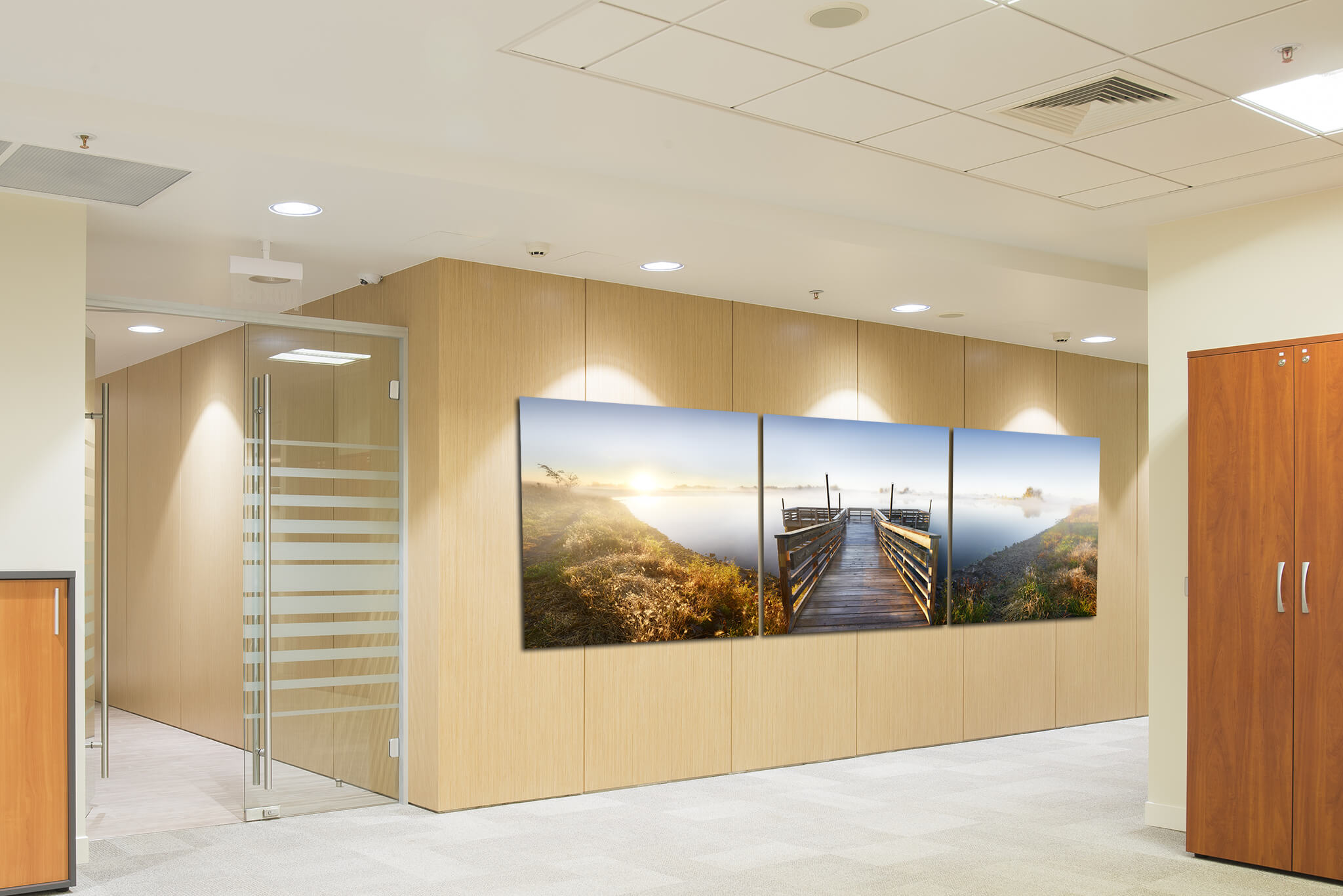
1. A symmetrical image works best for triptych pictures.
I might even say that a symmetrical image looks even better as a three piece artwork than it does a one piece. It is simply because the symmetry of the panels emphasizes the symmetry of the subject matter in the picture.
Take this one for example, called CORRIDOR. The left and right panels mirror each other until they meet in the center.
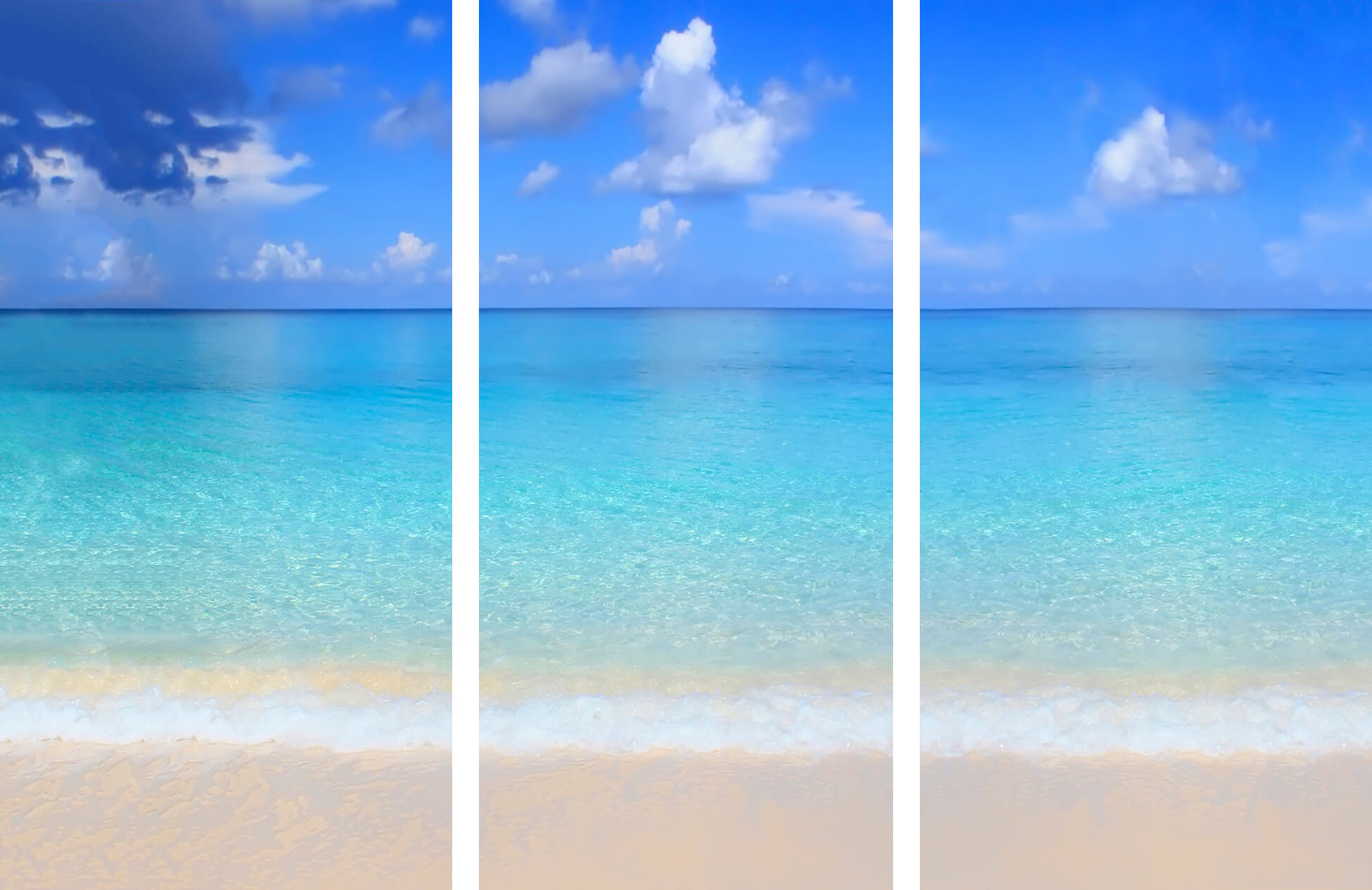
2. Simple subjects in pictures can be enhanced by a three-panel configuration.
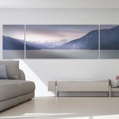
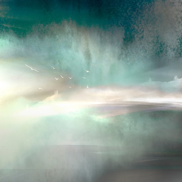
In this particular artwork called AQUA, the subject is quite simple and serene.
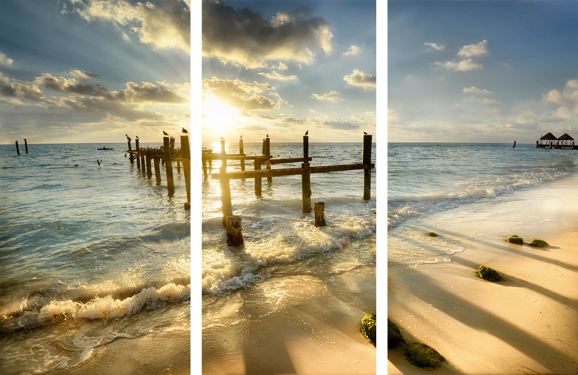
And contrast it with KINGDOM, which doesn't quite work here because of the more complex scene comprised of elements with detail in the foreground and background.
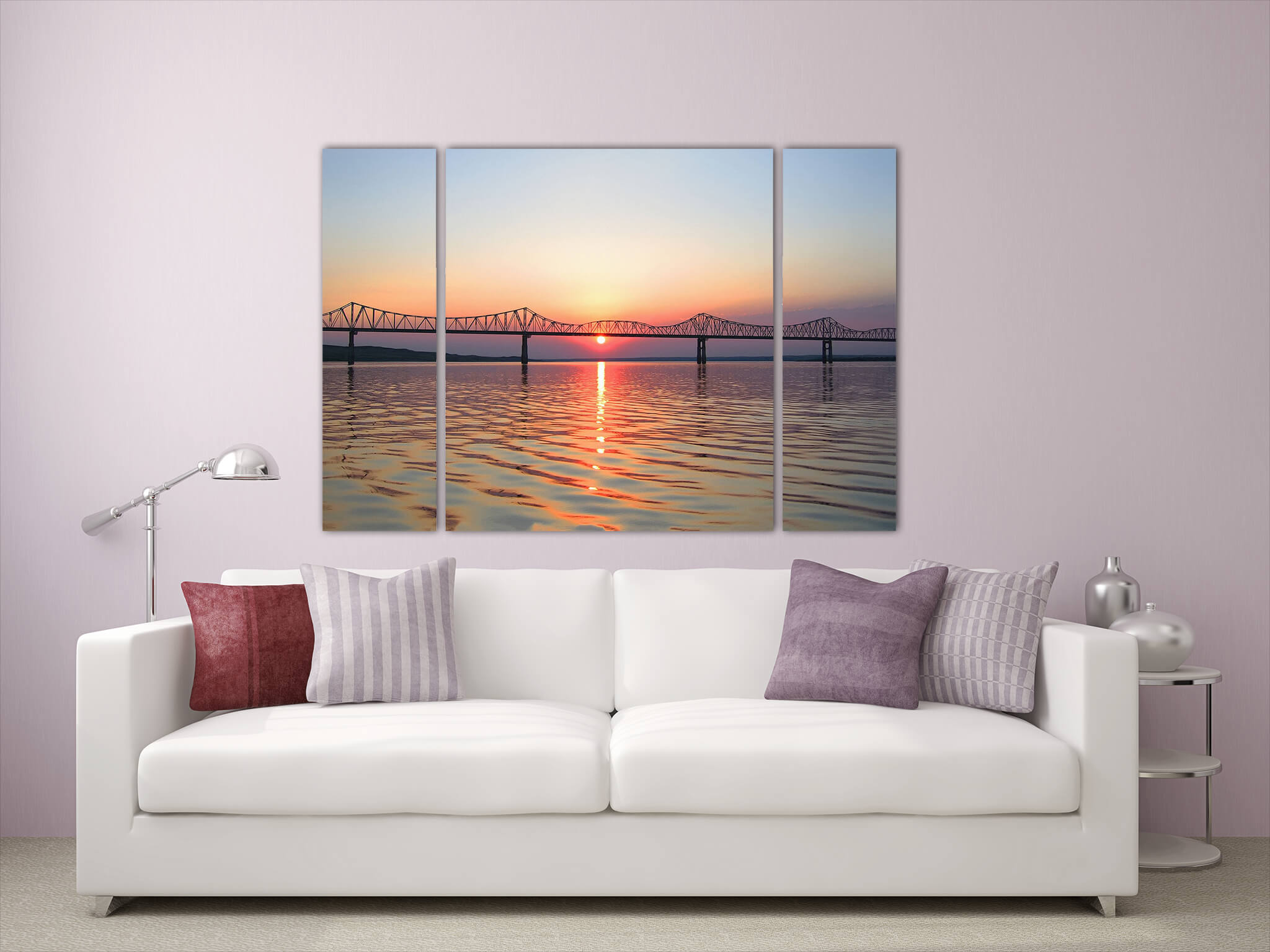
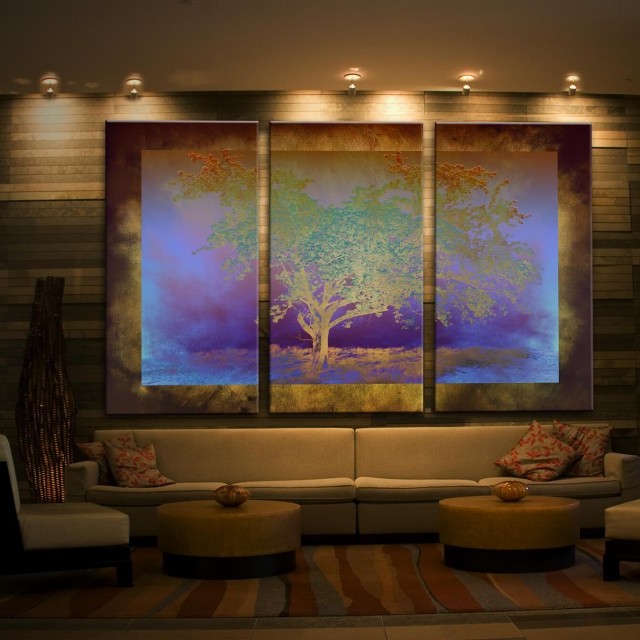
3. A centered subject is often perfect to transform into a triptych.
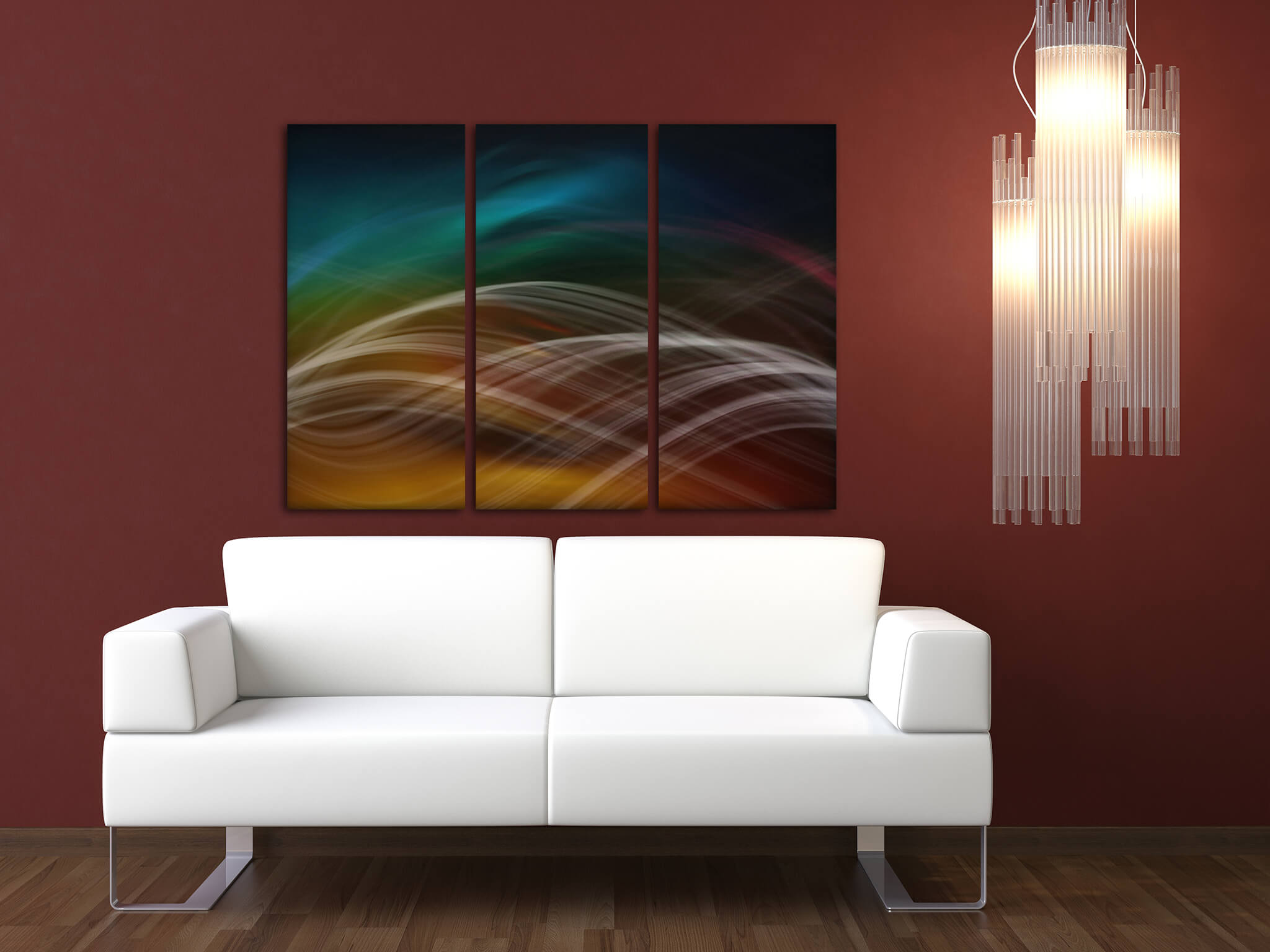
4. Strong lines that "flow" from panel to panel can be especially intriguing.
These are often abstract images with heavy graphical elements. When a line picks up where the other one left off, the paneled look adds intention and visual intrigue.
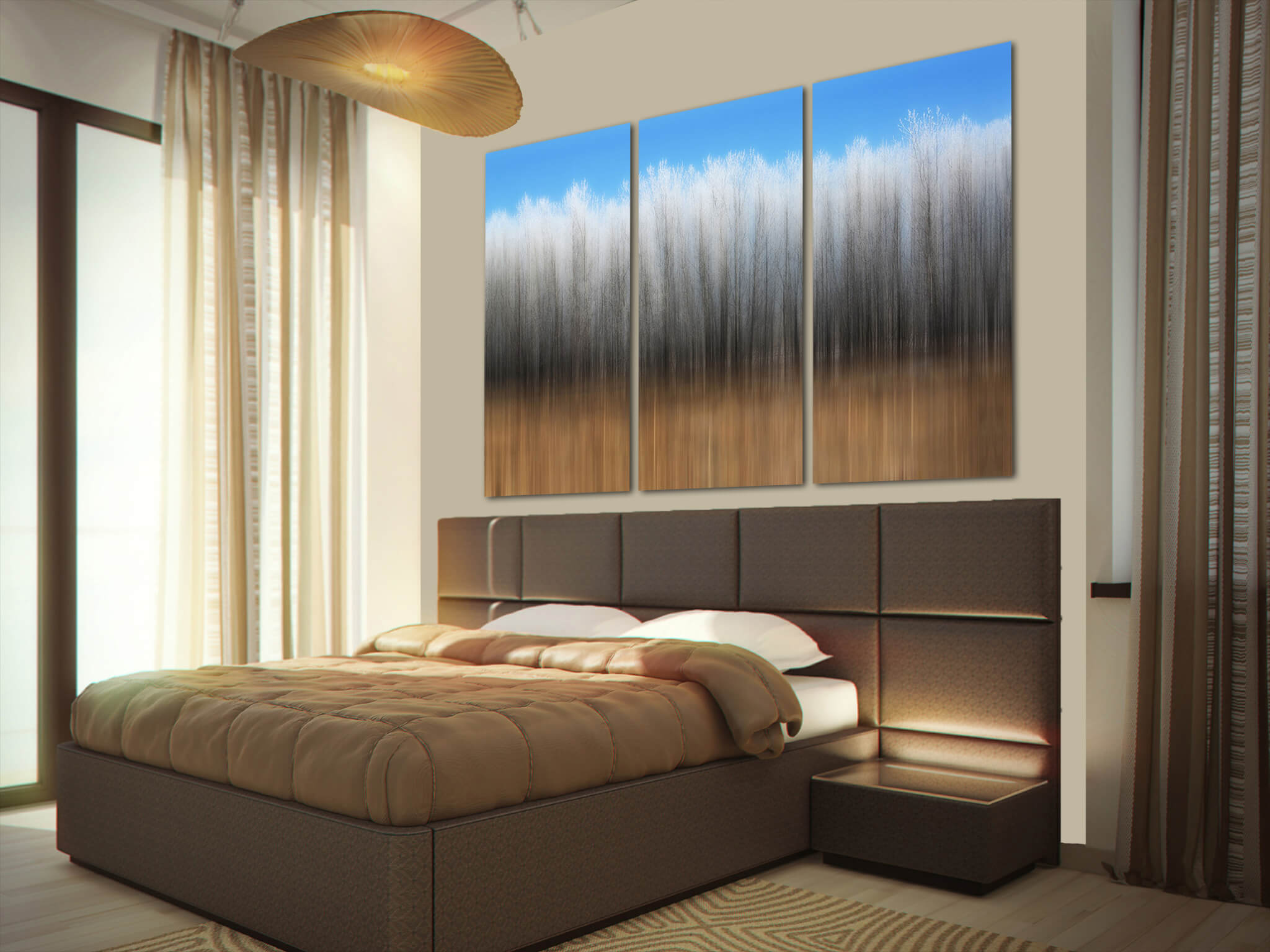
5. Similarly, numerous strong vertical lines make it so that the breaks in the panels are not obtrusive.
What images should I avoid when creating a triptych?
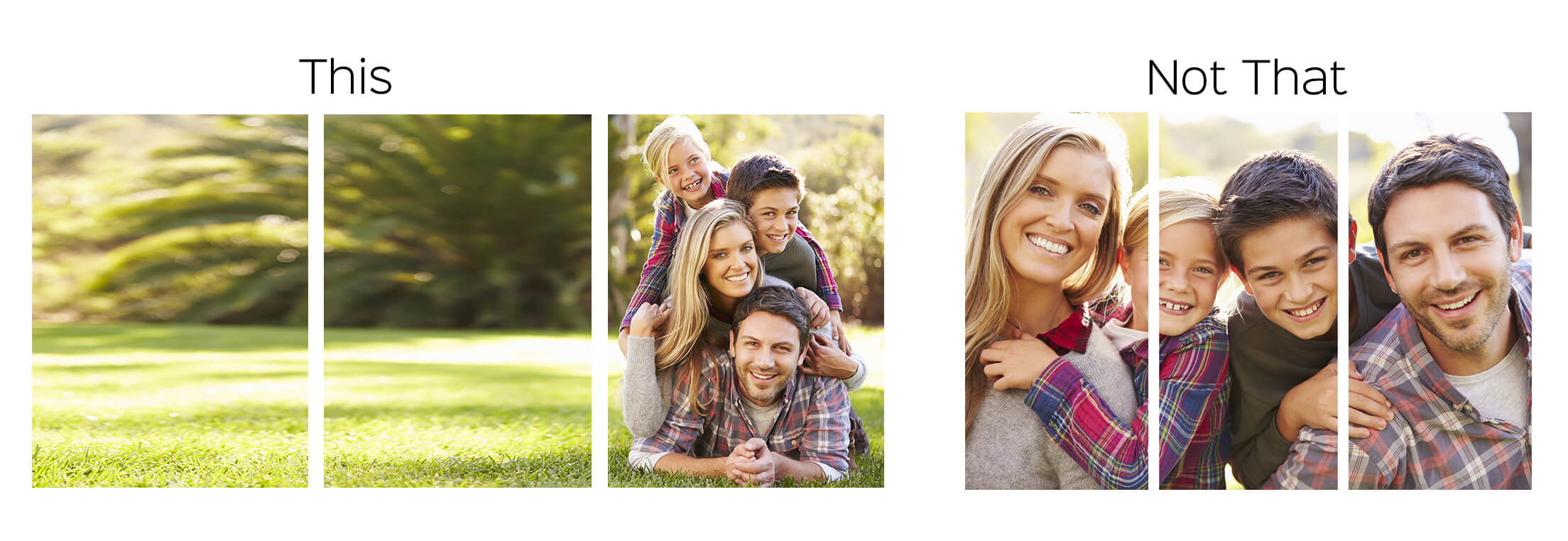
1. In general, people portraits are not ideal for triptychs.
This is simply because slicing off body parts or facial features just doesn't look very good, right?
One exception, however, would be if you have a wide background, so that each person can be in a panel by themselves or lumped together in one.
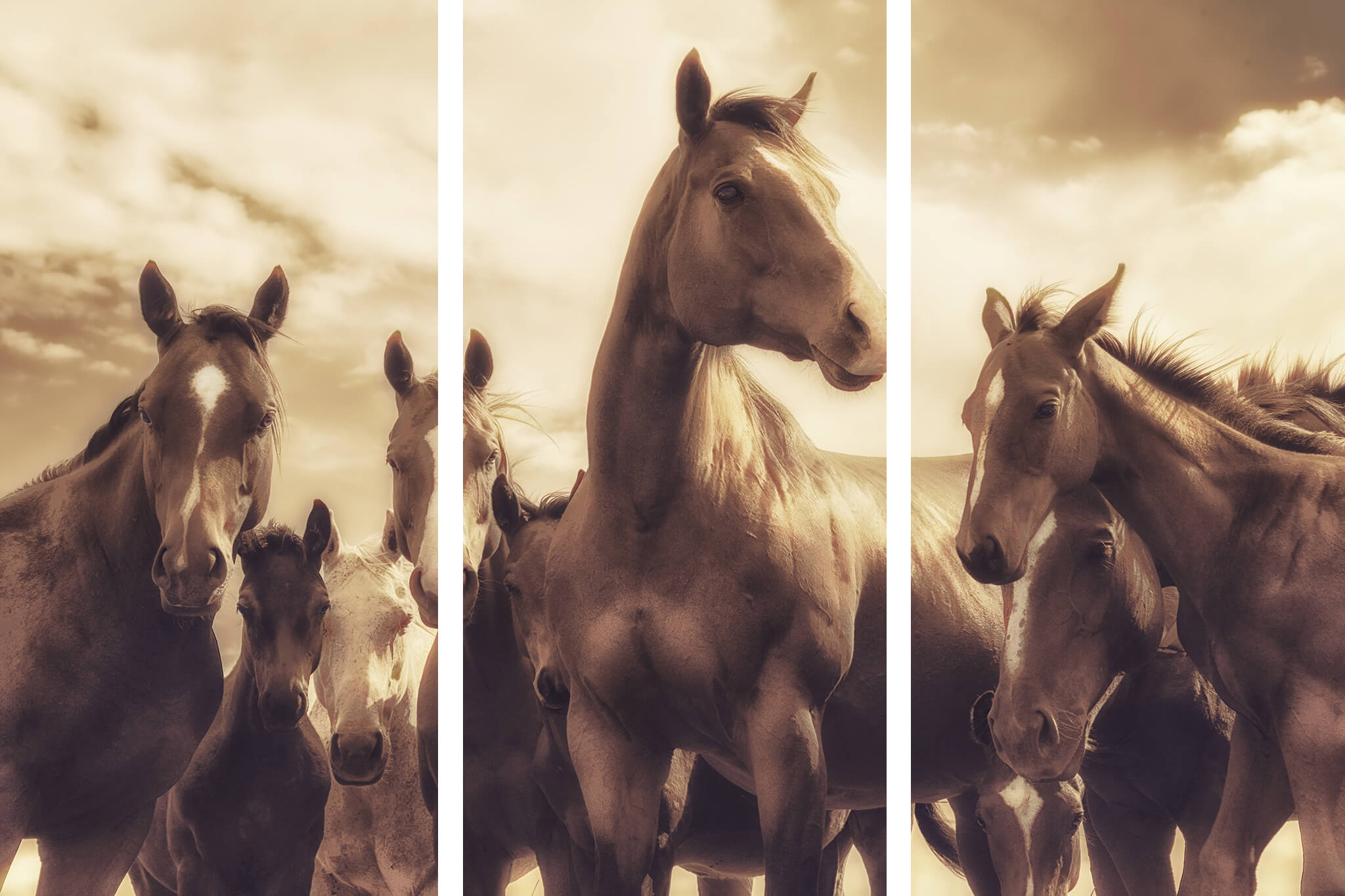
2. Just the same, animal portraits often do not work like this one here, called NINE.
3. Avoid the rule of thirds.
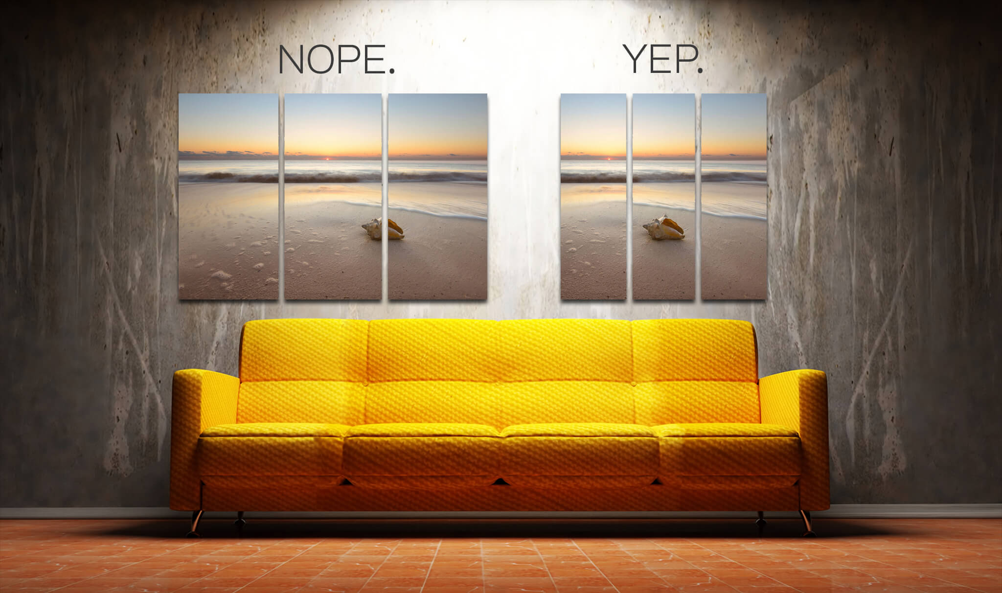
One of photography's longstanding rules is called the rule of thirds. Basically, you're supposed to make a tic-tac-toe board on your viewfinder and place the subject on one of the 4 intersecting points of those converging lines. You can read more about the rule of thirds in detail. Ironically, if you follow this rule, it will NOT make a great triptych because your subject will be cut out of the image since it will be resting on the third of the slice.
In its form right out of the camera, ASHORE would not make a triptych since the seashell is cut right down the middle. Since that is the main focal point, you'd want to make absolutely sure that it is not cropped off. So in stead you'd want to put the seashell outside the intersecting points.
Not all is lost though. By cropping the image and changing it's proportions, we could still make a square triptych, but that does come at the expense of throwing some of the image away.
Not all triptychs need to be created equal.
You can choose to slice your images into three unequal slices, to make sure no necessary components of your composition are cut out.
