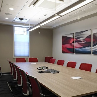
Years went by and it was time for a design update in the space.
Dr. Jim emailed me asking for some ideas to update his main hallway in his practice.
I'm always excited to see how big of a transformation takes place simply by updating the wall art.
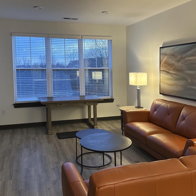
Dr. Jim sent me a current picture of his main hallway he was targeting.
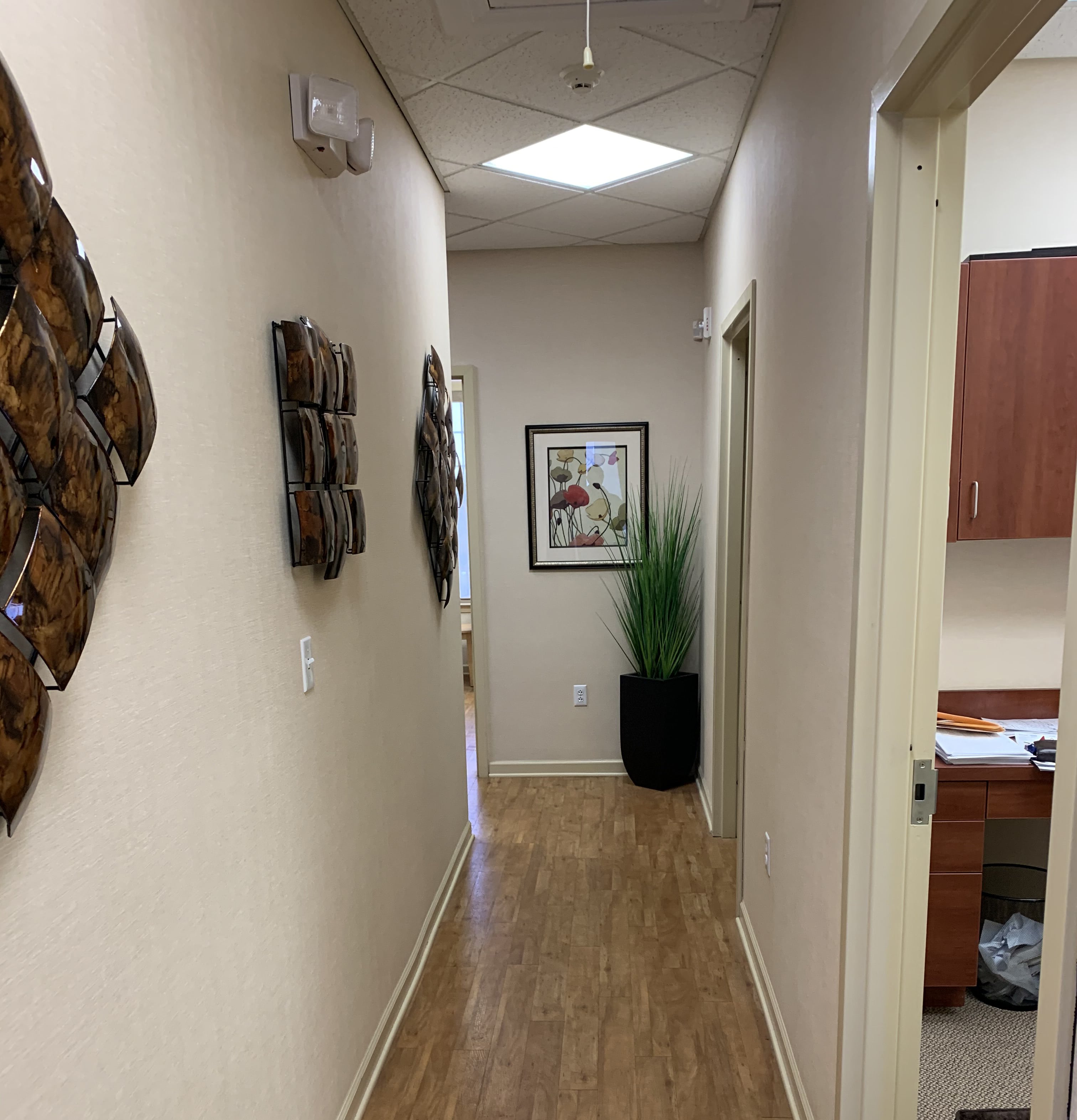
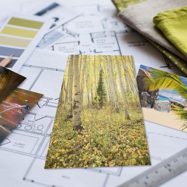
Since Dr. Jim didn't have any strong preferences, I decided to start from scratch and show him two concepts. One would use pure abstract artworks, while the other would be abstract nature artworks.

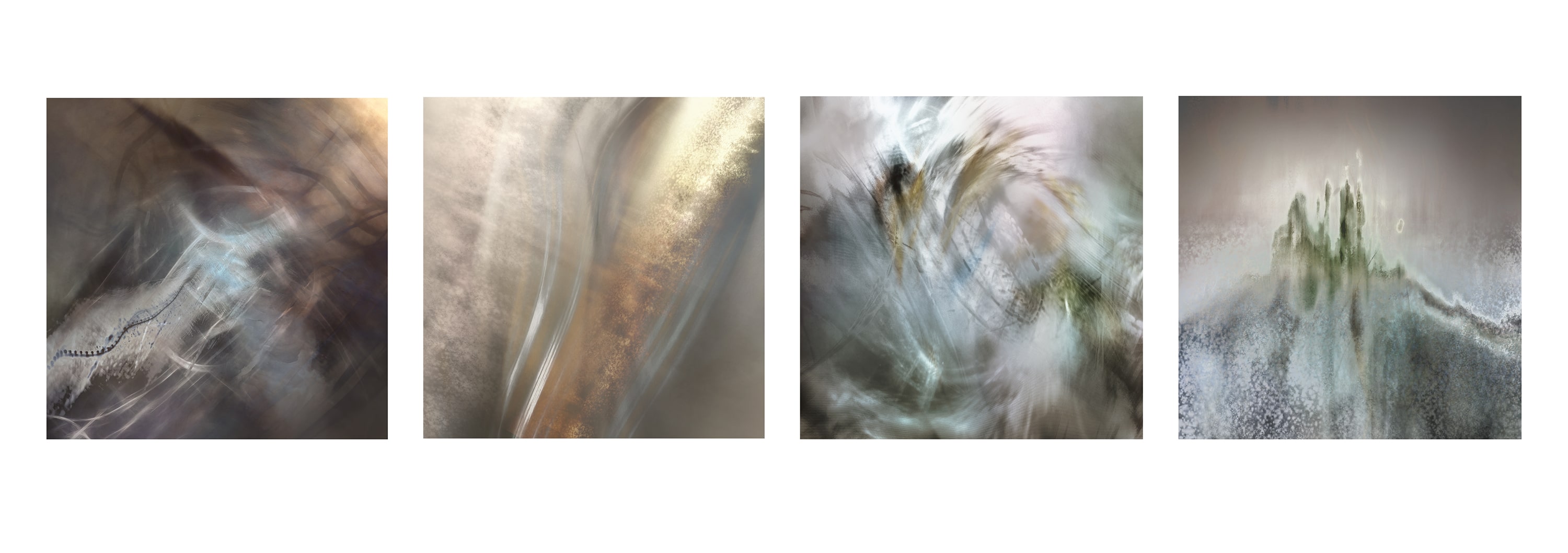
Dr. Jim loved the pure abstracts, so we were off and running.
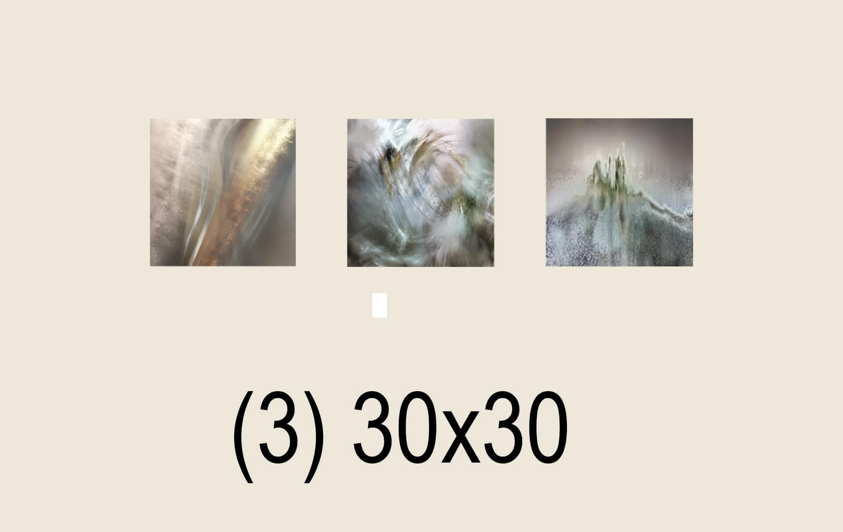
Next came focusing in on the shape and layout on the walls. We ran through a few different concepts, but ultimately, it came down to shapes and coordinating the positioning around the light switch (my nemesis.)
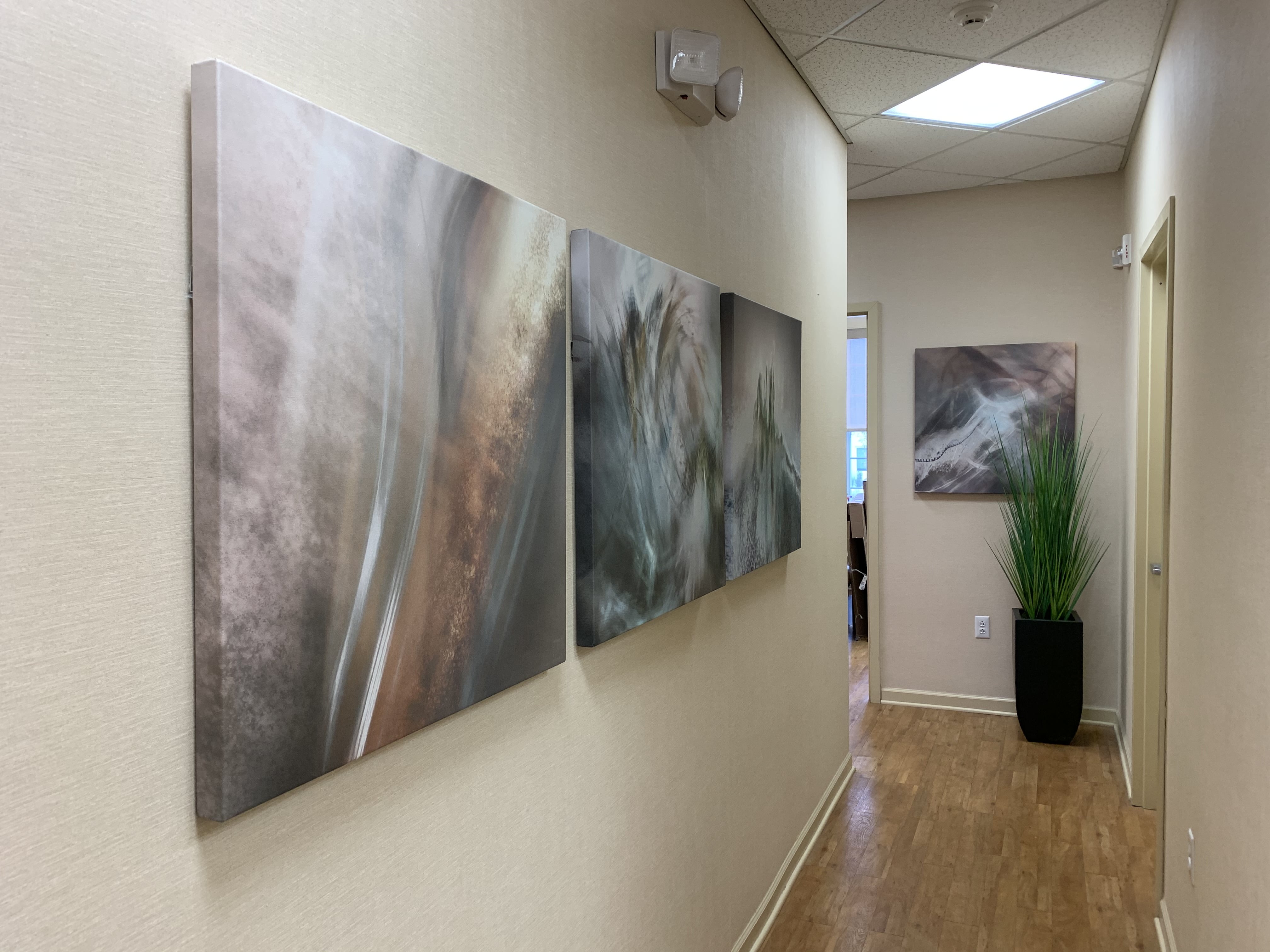
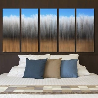
Dr. Jim loved it so much we then outfitted his bedroom at home ;-)
